When the Pantone Color of the Year is a 90’s Victorian nightmare

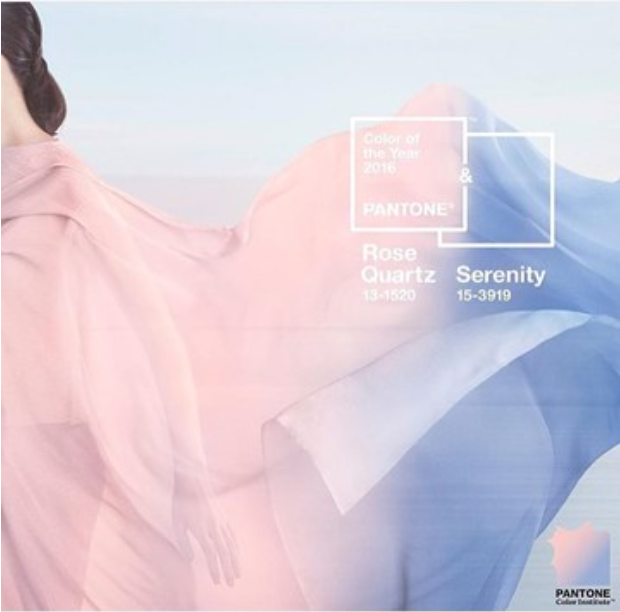
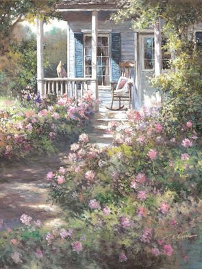
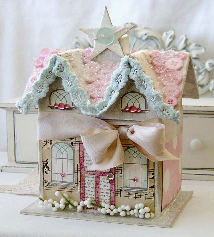
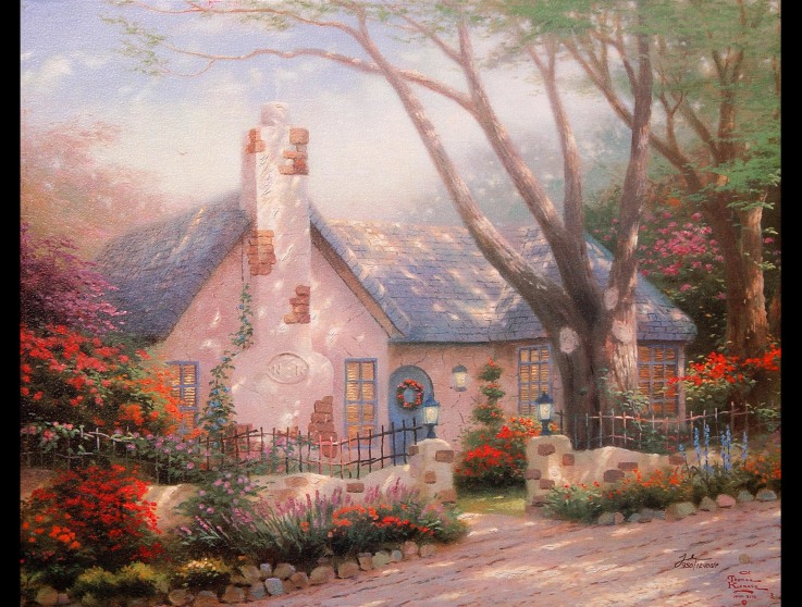
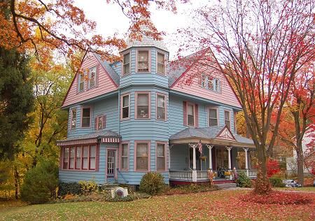
When I saw the Pantone Colors of 2016 ( more is more. we now have 2 Colors of the year), these are the thoughts that entered my mind:
1. Oh yes. I painted my Victorian dollhouse those exact colors. A long time ago.
2. The Barbie dream house is finally “in” again. Alleluia.
3. Thomas Kincade, may he rest in peace, would have been TOTALLY psyched.
Friends. Shall I confess? I do not currently plan on using these colors in my home. Especially the blue tone of “Serenity,” which is truly not a fan fave of mine. To me, Serenity, is the epitome of country blue and can only be used successfully by the rare decorating genius, like Angela or Kelly Wearstler. Just being honest.
Then, I silenced the critic and went on a hunt to see if I could even find some beautiful fashion and interior spaces that were based on this combo. And in my snarky, yet humble, opinion, I think I found some winners. Just a few:
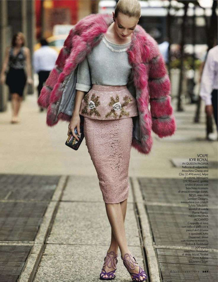

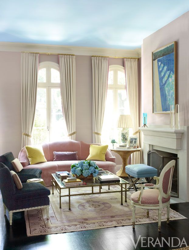
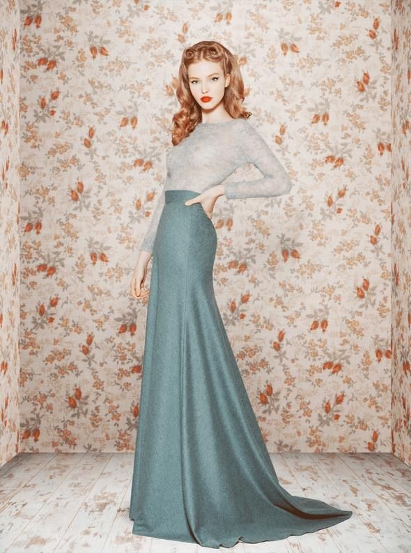
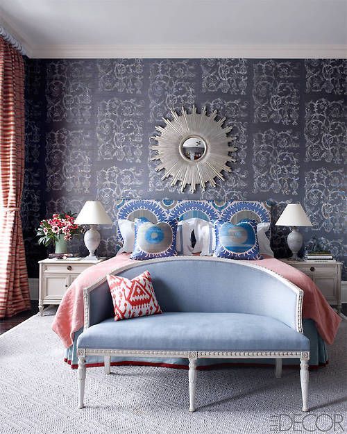
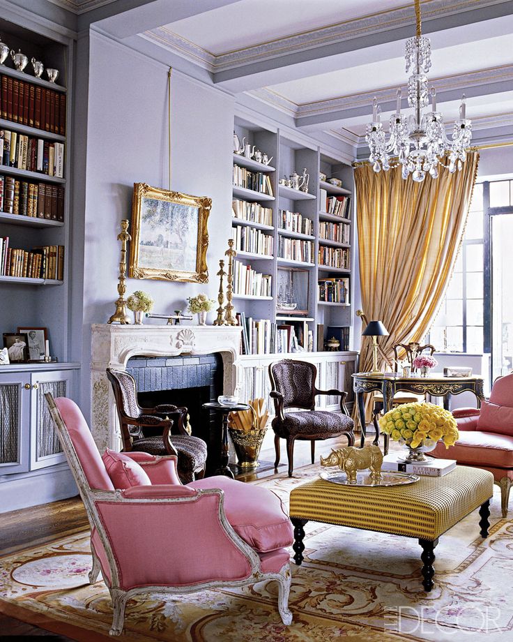
Dear friends. That is all I’ve got for you on this one.
What about you? What do YOU think of the Pantone Colors of 2016??
.
.
.
.
Take daily, bite-size steps toward living in a home you LOVE: Be sure to subscribe to FHD via email, bloglovin, your fave reader, and follow Fieldstone Hill on Twitter, Instagram, and Facebook!
MY GENEROUS SPONSOR:
This post is generously sponsored by my YL. I am into natural choices for my family, and this is the main way I avoided toxins during pregnancy, and now our family is hooked. My Young Living essential oils are also my business, and the oils are so well loved that they sponsor my blog!!! Thank you, friends! Enroll by clicking here.
I am SUPER excited about the new Premium Starter Kit. You are going to LOVE it… unless you hate things that smell heavenly and make you smile. #spaliving #livewithbeauty #wellness #MyHouseSmellsLikeASpa
* * *
Don’t miss a single post from Fieldstone Hill Design! Have regular decorating goodness delivered {free!} directly to your inbox.
{This post contains affiliate links. Thank you so much for reading and supporting FHD! }













Ugh … I am no interior decorator, but my bedroom colors in the 80s were rose and country blue. It was quite trendy with a floral comforter and striped dust ruffle (remember when they were called that?) and accents of rose wooden hearts here and there. I have no plans on going back to that color scheme anytime soon.
I saw this a few days ago. In my opinion, Pantone has missed it for the last 3 years. This one is no different – a total miss.
The 80’s called, they went their ‘country kitchen’ colors back. Like, this reminds me canisters decorated with painted geese. Ah, well. There’s always 2017.
My sweet mother -in-law would be so very happy. Her house French Rococo blue and pink living room will be in style. Oh My! I didn’t think anyone else would dare decorate with those colors again. Probably the only thing we didn’t see eye to eye on was the value of those two colors…together. I agree with Paula, Pantone got it way wrong.
That blue is actually just about my favorite color. I know it’s country clutter looking and ought to be relegated to utensil holders with ducks in gingham scarves. But I don’t care. It still makes me relaxed everytime I see it.
For years I’ve said that my favorite color is pantone 16-4120, but you can see they are similar.
I don’t have it in my house yet, really, but I would love to. I think it would look fabulous with copper.
It does pretty well seal my fate as a total style fail, however, lol!
Pantone colour of the year is suppose to be a colour…not a colour combination. Huge difference between those two. It is for the various disciplines to come up with fresh and challenging ways to use and emphasize the colour of year. What a blunder…
In trying to make conversation with my 17yr old stepson of few intelligible words this am I explained to him that there is actually a “color of the year”. Much like the TIME person of the year. I got an inaudible grunt when I showed him the color combo shot. His comment: “that’s two colors, that’s like Bruce Jenner being chosen for person of the year”.
I hate it. But your new images of it make me want it…
What were they thinking? May be fashionable, but other than a few of the photos you shared and using them in a very modern way, I’m still not into either of the colors. Dreadful! Reminds me of a funeral home where I grew up. And the name of the funeral home was “Gross Mortuary.” My sentiments exactly!
I hear you. uck. Last year’s color was not good either. Who is picking these colors and why???
I laughed out loud when I read your post title I think maybe they go for the ugliest thing they can think of in hopes of being ahead of any trends? …like sometimes I try to find the ugliest thing in the thrift store because no one else has tried to make it better yet?? …and sometimes I fail HARD
Well, let’s just say that it’s in the same rank as last year’s mess.
I love them. Flat out love. Course, I’m 70. Seriously, I’m betting you could find some gorgeous combinations of those tones. (individually …along with soft greys, pearl tones, etc.) Who says they have to be used together. I’m too old for this blog but I love it so I’m staying:)
I adore you. Your comment had me in stitches and you had better stay, because I adore you!!! Still giggling….
Oh my gosh. No thank you! I have been there and done that in the 80’s and don’t plan on doing it again. Glad to reconnect with you when I got an email from you with Young Living-I think we are in the same upline thingy-I’m just getting started with all this.