I received this question from a client the other day, and I know it is a great design question that many people wonder about. Below is posted her question, and then, my thoughts on the matter:
{Lisa}:
I’m actually in the process of changing around our kitchen “theme”. I am going with a wine theme. Are themes stupid?? LOL. Like is that a big design no-no…to go with one theme or is it better to mix and match stuff for a more eclectic feel?
{darlene}:
Your question about themes is a great one!
My opinion? {keep in mind, design is all about opinions!}: I think it is better to think more broadly, and go with color schemes as opposed to decor themes. My reasoning is two fold:
- long term value
- real is better than faux
1. Long term value
If you fill your kitchen with wine-themed items, it will require an investment into items that you cannot use again once you are ready to redesign, or if you tire of your theme.
2. Real is better than faux
Usually, using a theme involves purchasing items that have your theme printed on them or painted on them. I, personally, think that this cheapens your decor.
Instead, use your wine idea as Accent Pieces throughout, but not actually printed onto any fabric. Use REAL wine stuff… not pictures or images of wine stuff. How about using wine glasses, bottles, decanters, even beautiful bowls overflowing with grapes etc.?
For example, try to avoid buying a rug that has pictures of wine items on it… instead get a rug that ties into your color scheme.
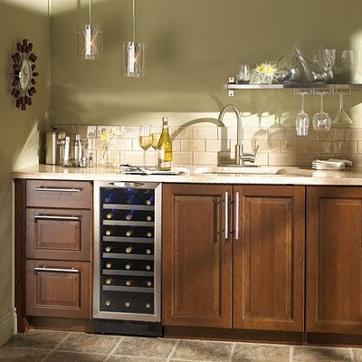
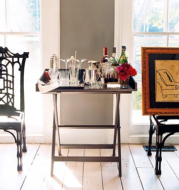
Decorate your counters with a line of beautiful wine bottles, a decanter, and a tray of gorgeous wine glasses. Make an effort to keep fresh grapes on display.
Then, if you cannot resist the itch, you could buy one sign that you love that declares your love for wine {try to avoid vines and painted wine glasses; just words} and hang it among real art {not prints! support your local artist and add class to your decor in the process} that depicts wine or grapes. You could also go with beautiful, framed photography of black and white wine glasses or bottles, or beautiful color photos of the tuscan landscape.
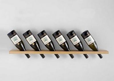
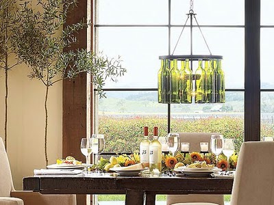
here are examples of what I would call faux decor:


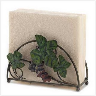
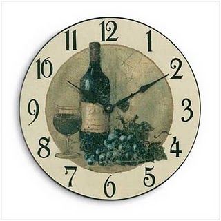
Thank you Darlene. I had been wondering if to go with a Japanese theme for my bedroom since painting the wall green and finding that I did already have some things that matched. But I don't want it to look crazy or like I am trying too hard. Food for thought! Thanks. (Oh and I will show some photos when it is finished – but it may be some time!)
Great sdvice. Besides the reasons you stated, I also think by not having everything in a room the same it makes the space much more interesting.
Nice job without that cutesy look of vines and grapes.
Great answer!
before I read your post, I would've said theme. now I say no theme. Your post explained what to do beautifully. I plan to send a link to all my friends and am going to rethink everything I do decorwise in the future.
I don't do 'themes' so much as I do 'feels'. Tho I will have to admit, our master bedroom pushes that really hard (ocean/NW beach).
The thing about adding signs is sometimes that is what really pushes it into a full fledged theme as it make a literal statement (title) for the room.
RIGHT ON girl!
i'm a no theme type of girl. of course that is not the popular choice around here. roosters and flags reign supreme. lol I think you can do a theme and it can be cool and cute BUT you have to know what you are doing so that it doesn't turn tacky and chincy. wow. it actually sounds like a decorate with purpose…lol
You're absolutely right. It's a "feeling" opposed to a visible theme.
I love this post!! I made the mistake of going with wine/grape theme a few years ago and now I'm tired of the themed items! I am now in the process of changing things to coordinate with my color scheme and to just go "with a feeling", instead of a "theme"!!
great advice!!! and given in a great way, too! as for me… I agree (themes are good for parties, but that's about it)
The only time I am okay with themes is in a child's bedroom that will get changed out in a few years anyway. And even then I try to stick to just a few quality statement accessories (nothing cheap or tacky) that can be changed out to give the room a whole new feel immediately. If you have just a few pieces that can be replaced and the rest of the colors, patterns, and pieces are classic and coordinated, you're not committing as much and you can still reflect the current interests of the child.
For grown-up decor, I'm a no-theme kinda girl.
NO THEMES! =) Ok, so when we bought our home 3 years ago, the owners had it beautifully decorated. The kitchen was a "fruit" kitchen. Fruit tile, decorations, cabinet pulls, light fixture, wall paper! Holy cow, it's taking me 3 years to get rid of it all! The tile is the worst. Don't get me wrong, it's high end, great quality stuff, which makes it hard to get rid of since I'm so practical, but I'm SO tired of it. I'm just beginning to understand what I REALLY like and themes don't do it for me. Go with a feel and colors you love, then add a few inexpensive functional theme items if you wish. When you are tired of the theme, donate, sell, share and you still have the feel you love. =) Happy decorating!
fhd press:
FHD’s popular posts
sponsors I love
peruse
shop like it’s your job
FHD in blogland
categories
31 Days of Favorite Spaces A room I love about me Affordable Designer Rooms beautiful colors beautiful thoughts Bebe bebe bebe nursery before and after BHG blogland built-in of the Week client spaces contrast decorating yourself defining your style design boards design in progress design question ditto ditto d.i.y. ditto-worthy designers en masse farmhouse simplicity five faves for a song from my files here at Fieldstone Hill hiding the uglies high-gloss glamour Home tour Images Of inspiration Inspired to lessons in design living with beauty Living with Beauty: Beauty Tips and Tricks Living with Beauty: Wellness Living with Beauty: Whole Food Eating Living with Beauty: Within Master Designer mixed metals must have objects organizing overcome decorating paralysis project project kitchen project library project nursery punch color renovation rituals room by room sponsor style notebook traditions trends Uncategorized vision
Archives
Theme by Design by Kendall