Last week, Pantone announced its Color of the Year 2015 in this press release:
Marsala!
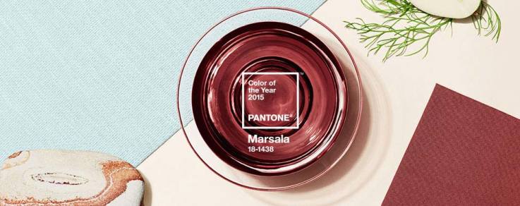
Think Faded-Wine-Red
I am already hearing lots of interesting buzz about this choice, and I’ll tell you – here is where I stand:
I have hardly ever met a color I didn’t like. The same goes for Marsala. Actually, I LOVE to be stretched out of my usual color palette and think of ways that I can be creative, making a new color work for me. When you are an interior designer, making a color work is kinda just a day in the office.
Sometimes you have to work around that sofa. Or that family heirloom. Or that client fave that you could (personally) do without.
And it is in that spirit that I pretty much ADORE the challenge of making any color work. So if Marsala is not your instant cup of tea, challenge yourself to pair it with colors that ARE your cup of tea. It may be just the kick (or calm) your space needed.
If you are itching to know how to incorporate a new, fun color into your space, I shared tons of tips in my post about last year’s color of the year, Radiant Orchid.
And I definitely recommend taking the Color Quiz that I wrote up. This will help you figure out how much to bring a “new, trendy” color into your space.
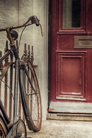
Enjoy some Marsala eye candy,
and envision adding a splash of this faded-wine-red into your home and wardrobe:
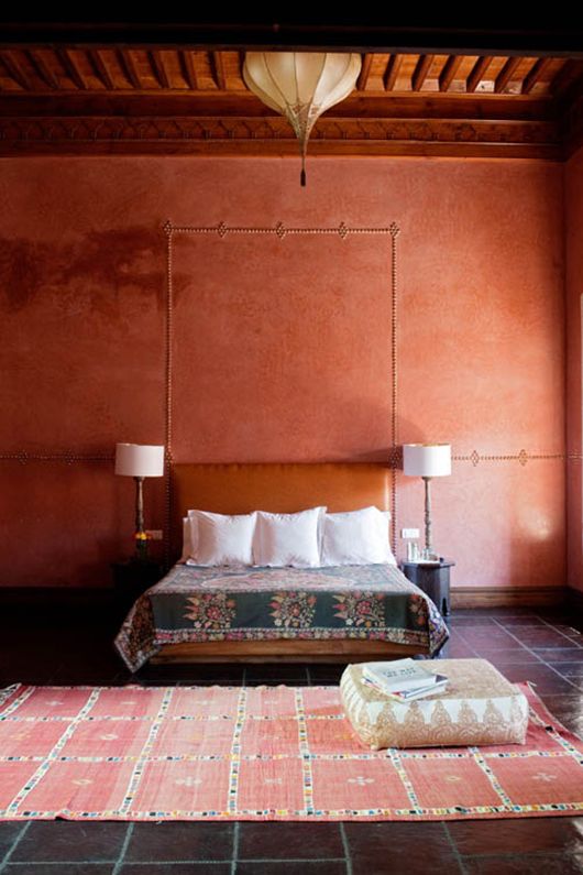
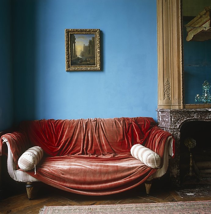
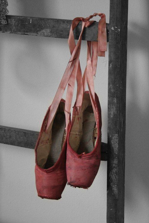
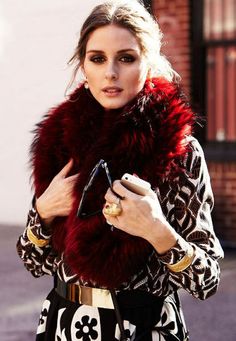
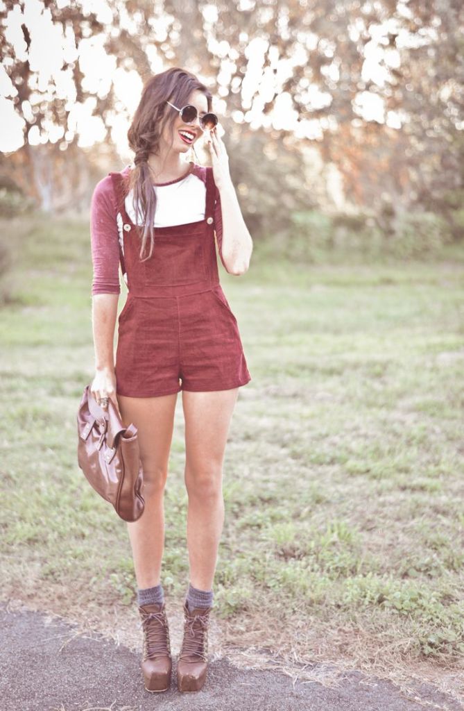
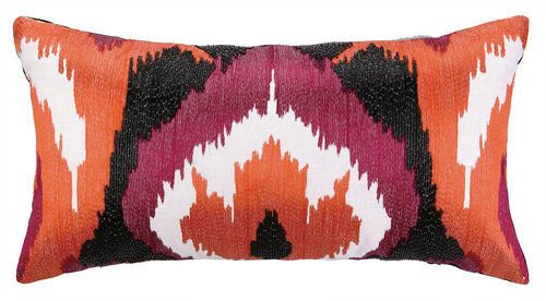
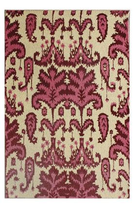
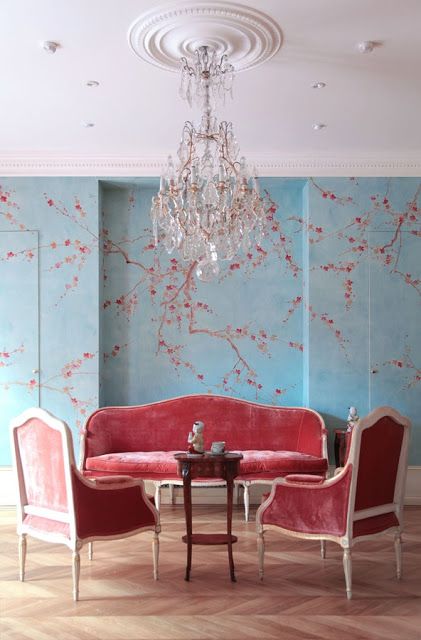
I am especially loving this pale red paired up with cool tones, like the blue walls above. Stunning.
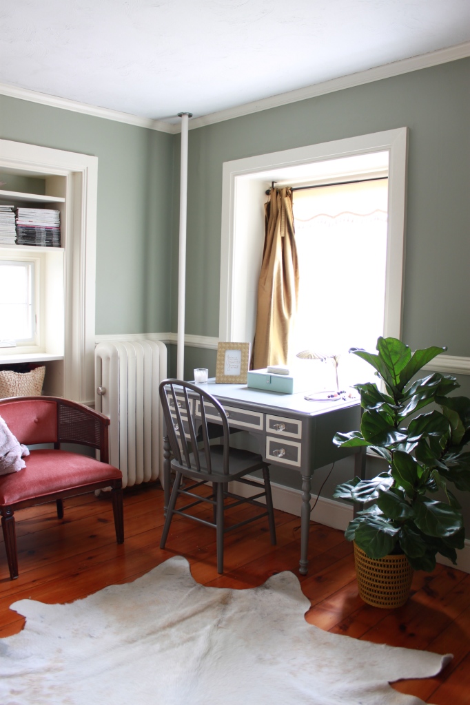
And I was tickled to discover that I already have a dash of marsala in our master bedroom, in the pretty little corner chair:
Do tell! What do YOU think of Marsala for 2015?
Would you be willing to toss a Marsala pillow into your mix?
#Pantone #coloroftheyear2015 #thinkfadedwinered
Thank you for using my links this Christmas season! Your support of this blog means the world to me! Merry Christmas!
* * * * *
Take daily, bite-size steps toward living in a home you LOVE: Be sure to subscribe to FHD via email, bloglovin, your fave reader, and follow Fieldstone Hill on Twitter, Instagram, and Facebook!
* * *
You have probably been hearing lots of buzz about essential oils. If you are curious about why they are taking the world by storm, you have to read this post. There is a very real reason everyone loves them. You will love your oils too! One great thing about the oil kit is that you can use it to make your own holiday gifts! Soo…. a gift for you, and a gift for everyone else on your list! Gets yours by clicking here to sign up.
EXTENDED FOR ONE FINAL WEEK UNTIL DECEMBER FIFTEENTH:
* * * * *
Don’t miss a single post from Fieldstone Hill Design! Have regular decorating goodness delivered {free!} directly to your inbox.
{This post contains affiliate links. Thank you so much for reading and supporting FHD! }


Do not like it at all. Remind s me of the burgundy and hunter green of the 90’s. Or was it the 80’s.
Do not like it at all. Remind s me of the burgundy and hunter green of the 90’s. Or was it the 80’s.
Oops. Didn’t mean to leave two comments. My phone is acting weird.
I like it better since I saw your take on it. My favorite is the red paired with the blue. That’s an exciting combination.
I agree with Ms. Nancy. I was actually going to say the same words as her
I actually liked it immediately. I seem to be in the minority though. I think it can be either quiet or very rich and sophisticated. But I have been around long enough to see ALL the colors repeat themselves sooner or later. It really depends on what is paired with it and where it is used. Had a mani/pedi on Sat in the color and it looks rich with depthAND it goes with everything from my Christmas red scarf to my little black dress to my brown boots!
I have this unusual color in a rug in my living room and could never put my finger on what to call it! I’ve been calling it dusty red. I like Marsala much better. I do like it very much and your pictures have been very inspirational as to what colors to pair with it!
I like it. But fear we might get a throw back to the mauve of the late 80’s early 90’s. I cannot even believe that I chose that color when decorating our beautiful new church… that and a dusty teal. Oh well…previously the old church was orange and brown. It’s all kind of humorous. Fortunately they did give the building a face lift with new makeup – so to speak. Lots of tones… no colors. 😉
would be a huge change for me at present but I can see myself wearing marsala! might be fun!
I wouldn’t have chosen marsala, but it’s growing on me. These are great inspiration images, and you make a good point about the fun of the challenge. 🙂
[…] a room filled-to-the-brim with warmth {this pic was shared in my Pantone Color of the Year post last week} gets a breath of fresh air with crisp white pillowcases and white lamp […]
[…] Milk, Love Happens, Minds Sparkle Mag, A – Interior Designs, Fieldstone Hill Design, Scandinavian Retreat, SF Girl by Bay, Ahora Tambien Mama, Amber Interior […]
Colors perfect for these environments, well crafted
fhd press:
FHD’s popular posts
sponsors I love
peruse
shop like it’s your job
FHD in blogland
categories
31 Days of Favorite Spaces A room I love about me Affordable Designer Rooms beautiful colors beautiful thoughts Bebe bebe bebe nursery before and after BHG blogland built-in of the Week client spaces contrast decorating yourself defining your style design boards design in progress design question ditto ditto d.i.y. ditto-worthy designers en masse farmhouse simplicity five faves for a song from my files here at Fieldstone Hill hiding the uglies high-gloss glamour Home tour Images Of inspiration Inspired to lessons in design living with beauty Living with Beauty: Beauty Tips and Tricks Living with Beauty: Wellness Living with Beauty: Whole Food Eating Living with Beauty: Within Master Designer mixed metals must have objects organizing overcome decorating paralysis project project kitchen project library project nursery punch color renovation rituals room by room sponsor style notebook traditions trends Uncategorized vision
Archives
Theme by Design by Kendall