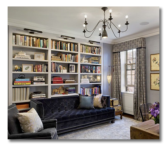
I love the smart design elements in this library office combo, designed by Jennifer Eisenstadt. This space is so well thought-out and has a stunningly sophisticated feel, which is just right for both a library and office. At the same time, this space feels accessible and practical to me; something I could see in my own home that could serve my family well.
{FHD’s “ A Room I Love” series….just a simple hello, from me to you, featuring a Room that I Love, and a quick list of why I love it. If you study what you love about a space, it helps you to bring what you LOVE into your own home!}
Do you love it?:
{design by Jennifer Eisenstadt, image via Made By Girl. For more images from this space, check out Made By Girl’s post.}
WHAT I LOVE:
1. The gutsy placement of the sofa RIGHT in front of the bookshelves. This makes the space!
2. Tufted navy velvet. Need I say more?
3. The portrait lamps above the library shelves.
4. Dramatic ceiling to floor drapes in soothing silver.
5. Bringing a clean-surface desk and chair into the library.
6. Bookshelves packed with books!
7. The white piping on the upholstered pieces.
8. The soft silvers, charcoal and navy color combination.
DO YOU LOVE IT?? WHAT DO YOU LOVE? WHAT DESIGN ELEMENTS WOULD YOU BRING INTO YOUR OWN HOME? DO TELL!!!!!!
* * * * * * *
* * * * * * *

Don’t miss a single post from Fieldstone Hill Design! You can have every post delivered directly to your inbox. It is free, and your email is never used for another purpose.
be sure to check your email, confirm your subscription, and get your freebie link!
If the subscribe box does not work click here to go to the Fieldstone Hill Design page and submit in the right sidebar.


The color scheme is gorgeous and so restful. I have to say that right away my eye went to the portrait lights over the book shelves – such a great idea. The drapes are lovely.
I am a die-hard fan of portrait lights over bookshelf columns. Die hard!
I have always loved using a wall of books as a backdrop to furniture. Even though I am not typically a “blue” room person, I have to say this one looks very inviting and warm with all of the cool colors. Beautifully done!
Yes! I think that gray can be a “warm” if there is a presence of brown in the undertones. Also, velvet never hurts!
I love that navy velvet sofa! And, the drapes are beautiful, too. The one item I could do without is that floor lamp…the chandelier makes up for it though.
-Kristen
I am with you on the floor lamp. Not a fan. And I would love to see a crystal chandy in here, myself. You know, some glamour!!
Yep, another beautiful space! I immediately moaned over that sofa, SUPER pretty. I love navy blue lately, and that velvet makes it seem quiet and elegant and comfortable.
Wall-to-wall and floor-to-ceiling bookshelves are always a favorite too.
I also like the yellow-gold botanical prints contrasting against all of that cool silver and gray.
Thanks Darlene! Always an inspiring stop when I visit your blog! 🙂
Thanks, Marie!! Yes!! Those prints are fantastic!
Actually love it all from the sofa to the bookcases to those beautiful drapes and the lighting over the bookcases..(great idea)….
But really not in love with the chandelier…needs one with a little more bling…
I thought so too, Shirley. And I don’t like the floor lamp either. But still – what a great space!
More and more I want a velvet sofa. I want to feel that incredible texture under my fingers. This is a room I could happily live with.
velvet + sofa = love!
Its you!
I’ve been meaning to “visit your blog” (seeing you in comments on my blog) and now I see that I’ve been here many times before! Love your blog! I think I found your through The Painted House. This really is a gorgeous blog!
fhd press:
FHD’s popular posts
sponsors I love
peruse
shop like it’s your job
FHD in blogland
categories
31 Days of Favorite Spaces A room I love about me Affordable Designer Rooms beautiful colors beautiful thoughts Bebe bebe bebe nursery before and after BHG blogland built-in of the Week client spaces contrast decorating yourself defining your style design boards design in progress design question ditto ditto d.i.y. ditto-worthy designers en masse farmhouse simplicity five faves for a song from my files here at Fieldstone Hill hiding the uglies high-gloss glamour Home tour Images Of inspiration Inspired to lessons in design living with beauty Living with Beauty: Beauty Tips and Tricks Living with Beauty: Wellness Living with Beauty: Whole Food Eating Living with Beauty: Within Master Designer mixed metals must have objects organizing overcome decorating paralysis project project kitchen project library project nursery punch color renovation rituals room by room sponsor style notebook traditions trends Uncategorized vision
Archives
Theme by Design by Kendall