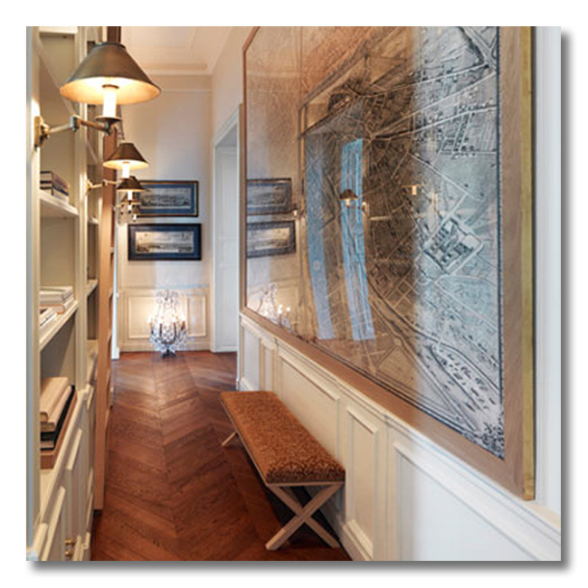
Today’s ditto is an example of interior design that really gets me excited. For some reason, I have always loved the challenge of small spaces, and of fitting every ounce of quality design that can be fit into a small space. Well, today’s narrow entryway fits that bill. This is one of the best examples of how to decorate a narrow entryway – or any narrow space, for that matter!
If you have a narrow entryway, take note. This tiny space is full of ideas!
The list below will break down for you many of the decorating concepts that are employed in this great space. As with all of our dittos, let’s study what makes this space SO AMAZING, so that we can learn how to add more beauty to OUR homes!!!
{And, as always, I look forward to hearing from you and finding out what you would ditto, too. So, be thinking!}
{The Pavillon de Madame residence, design by Jacque Grange.}
{To see more of this amazing space, click here}
DITTO :: {WHAT I WOULD STEAL FROM THIS SPACE}:
1. NARROW BOOKSHELVES.
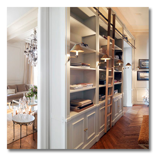
Undoubtably the most genius element in this narrow entryway is the feature of the narrow bookshelves. The shelves add height, storage, usefulness, beauty, and repetition to this tiny space… all in one fell swoop! Ditto!
2. A LARGE, LIGHT REFLECTING PIECE OF ART.
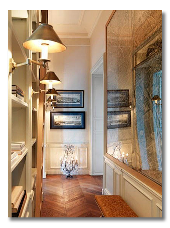
The art in this entryway helps the space appear larger in a couple of ways. One, it is very large, so it pulls the eye down the hall. Two, it reflects light because of the glass protected frame, which tricks the eye into seeing the space as larger. Three, the design, a map, has a linear pattern which also pulls the eye down the hall. Details like this really make a difference in a narrow entryway. Paying attention to the art details, and choosing art that broadens a narrow entry: Ditto.
3. DECORATIVE PANELING.
The simple decorative paneling that covers all of the walls and the lower portion of the bookshelves is a brilliant way to add interest to an entry hall without taking up any square footage. And one more thing! Any of the horizontal lines draw they eye down the hall toward the openings at the end of the hall, and any of the vertical lines add height to the space. Bonus.
4. CREAM WALLS.
I love creamy white walls in hallways or any other narrow spaces. I always find that it widens the space. And, of course, it is even more beautiful when the cream walls are architecturally pleasing, as these are. Cream allows the architecture to shine through.
5. HERRINGBONE PATTERNED WOOD FLOORS.
What gorgeous floors!! But once again, the beautiful details in this space are not just there for beauty’s sake. The exquisite herringbone pattern in these hardwoods works to widen the entryway visually, as well as pull the eye down the hall at the same time. Perfection for decorating a narrow space of any kind!
6. LIGHT ALONG THE PATH.
Those library lights are amazing. And when they are switched on, they call the eye to travel all the way down the entryhall. The eye never stops moving and never feels trapped in this tiny space. Ditto!!
7. REPETITION.
Repetition is such a great decorating tool, and it has even more impact in a narrow space because repetition allows the eye to comfortably move from space to space. Here the following elements are repeated in this space: the books, the repeated shape of the bookshelf rows and columns, the library sconces, the glass-framed map art, the decorative paneling, the herringbone pattern, and the closed cabinets on the bookshelves.
8. A LONG NARROW BENCH.
The bench is both useful and has the added benefit of drawing the eye through the space, due to its narrow shape. Its narrow profile also adds a great piece of furnishing to the entryway without taking up much room.
9. A DESTINATION.
This is the secret to decorating a small and narrow space well: There should be a destination for the eye. In this space, the eye is pulled toward two pieces of horizontal artwork, but the stronger destination is the natural sunlight that pours in from the end of the hall. Light is always the most effective destination element. The eye naturally wants to move toward it; therefore a narrow space can feel open and limitless if the eye detects an opening toward light. Personally, I think this is the best decorating element in the entire hallway. Ditto.
* * * * * * *
SO much goodness.
Love anything I did not mention? or…
WHAT WOULD YOU DITTO {STEAL} FROM THIS SPACE, 1-9? SOMETHING ELSE?
I LOVE HEARING YOUR THOUGHTS!
* * * * * * * *
Blog Advertising is an amazingly affordable way for advertisers to purchase the gold mine of Advertising: Trusted Word-of-mouth. I would love to partner with you as a sponsor of FHD! For more information, visit my Contact Page.

Don’t miss a single post from Fieldstone Hill Design! You can have every post delivered directly to your inbox. It is free, and your email is never used for another purpose.
Delivered by FeedBurner
be sure to check your email, confirm your subscription, and get your freebie link!
If the subscribe box does not work click here to go to the Fieldstone Hill Design page and submit in the right sidebar.
This post contains affiliate links. Thank you for supporting Fieldstone Hill Design via our links!


You know I’d steal all the books.
Swoon! I have a narrow hallway and could possibly recreate this very smoochie layout – thank you, Darlene! Practical and beautiful.
xomichele
Something tells me you can never have enough bookshelves, right, Michele??
#2, The artwork.
Really?
The large glass, reflective as it is, makes me feel more claustrophobic, not less. It feels as though it is bearing down on me. Maybe in person it would have a different impact?
#6, the lights. I love them–but not in such a narrow space–won’t I hit my head on them? (Unless they are higher than I think they are, in which case, I really like them.) It doesn’t seem like you could move the ladder, though.
#1 I love the shelves above and the cabinets below–incredibly practical. Again, I’m not convinced there’s really enough walking space. This isn’t an entryway so much as a pass through library with only a few books.
Nonetheless, #9 light to walk towards? Essential. Love it.
Thanks for showing us such a thought provoking space as always!
I know! I did not mention that about the ladder, but that bugs me that you couldn’t move it. Not a problem to have a stationery ladder, but why put in the rail?
I think if the lights were not extended, in real living, it would likely be better.
Thanks for your thoughts Alana!
Agree, the lights might be a traffic problem, esp for tall people and boisterous teens. I imagine the hallway is wider than the photo suggests. Do love that art piece and how it bounces light. Lots of storage in that bookcase, would love that. Elegant and functional. I would like to ditto this photo in my small entry!
Thanks for your great thoughts, Cheryl!
I love the ladder- I’ve always wanted a library with a ladder on a track! Totally using your tips and style wisdom as we look toward closing on this house and making it ours {for an undetermined amount of time!}! Any plans to install your own banya at the house!? 🙂
Oh, Tara!! We have the PERFECT spot for a banya. Too bad our old house has a HUGE list of to-do’s before that 🙁
I LOVE the banya!
I do love the bookcases though I know you could do a better job of filling them! And the idea of moving toward light is a great one…I just can’t think why a chandelier on the floor in a hall is a good idea.
hmmm. they must have meant to hang that! ha! {ps thanks for your sweet compliment on the bookshelf styling. blush!}
oh, how I love those herringbone floors! And, those swing-arm lamps – I adore…
right there with you, kristen!!
fhd press:
FHD’s popular posts
sponsors I love
peruse
shop like it’s your job
FHD in blogland
categories
31 Days of Favorite Spaces A room I love about me Affordable Designer Rooms beautiful colors beautiful thoughts Bebe bebe bebe nursery before and after BHG blogland built-in of the Week client spaces contrast decorating yourself defining your style design boards design in progress design question ditto ditto d.i.y. ditto-worthy designers en masse farmhouse simplicity five faves for a song from my files here at Fieldstone Hill hiding the uglies high-gloss glamour Home tour Images Of inspiration Inspired to lessons in design living with beauty Living with Beauty: Beauty Tips and Tricks Living with Beauty: Wellness Living with Beauty: Whole Food Eating Living with Beauty: Within Master Designer mixed metals must have objects organizing overcome decorating paralysis project project kitchen project library project nursery punch color renovation rituals room by room sponsor style notebook traditions trends Uncategorized vision
Archives
Theme by Design by Kendall