I have been thinking a lot about contrasts lately, and how using them wisely and creatively can add such amazing beauty to a space.
my little obsession?:
- I posted a lesson in using contrasts in design, as part of my new “Lessons in Design” post collection.
- I have been gathering up a slew of Pinterest pics on my newest board: “my thing for contrasts.”
- And I have been keeping my eyes peeled for exquisite examples of contrast in Creation. {you should try this. you will be amazed at how many contrasts you find that create natural beauty!}
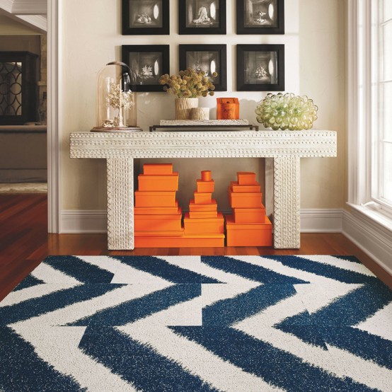
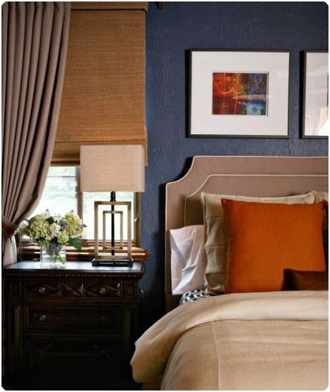
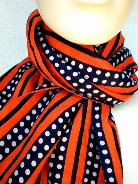
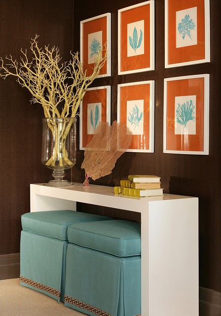
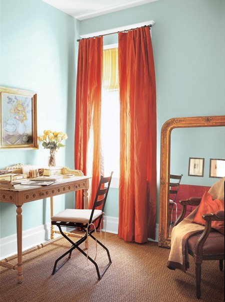
In collecting pictures, I have been just loving some of the spaces I have found that employ the color contrasts of blue and orange. Take this gorgeous space for example:
{also noteworthy are the contrasts of light and dark in this space as well}
This is not the first time I have posted about my love for this combination {see post here}. My grandma loved the combo of coral and navy, and she was sure to tell me that this color combination was both timeless and sophisticated. Yes, grandma!
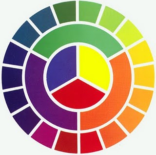
If you take a look-sy at the color wheel below, you can draw a line straight across from the orange to the blue. For color-wheel newbies, that means that these colors are “complementary” or opposite. Complementary colors will provide you with the most contrast.
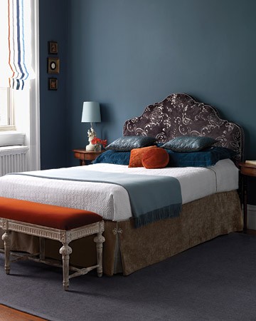
{…pumpkin velvet makes my heart sing. just sayin’}
{…does this pic make you as happy as it makes me?}
{…symmetrical and color harmony!}
To see my Design Boards, click here. To read more about my Design Services, click here.
And thank you to everyone who is cheering me on in my dream of Fieldstone Hill Design. Love Fieldstone Hill? thanks. you rock. Would you consider sharing the love by Following {this makes me giddy. click Follow in the right sidebar}, Liking on Facebook, Following on Twitter, Following on Pinterest, or linking here from your blog. I just knew you were awesome!


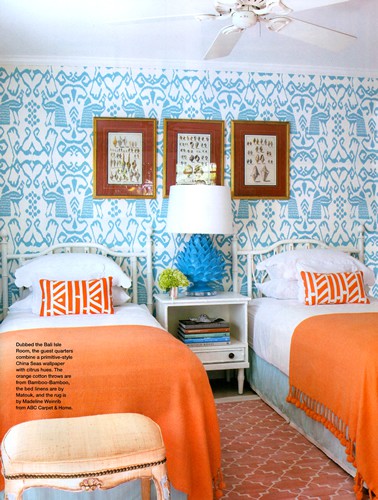
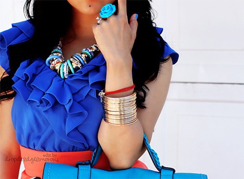
I want a room in my home like that photo of the twin beds with blue print wallpaper and orange throws on the beds. Pretty sure I had a dream about this very combo. Sigh. Such beauty! And of course, Blue and Orange are made for our family – we are the ultimate Boise State Bronco fans! 🙂
xoxo michele
Love the contrast thing! 🙂
I’m with you…orange is my favorite. I love it paired with peacock blue, chocolate brown, any gray, creams and whites, even apple or lime green. It just makes me happy!!
Yes, diane!!! From one orange lover to the next; it DOES make you happy, doesn’t it??!! Have a great day. SO glad to have you here at Fieldstone Hill!
This color all over New York. At Christmas!
[…] From my files :: blue and orange […]
fhd press:
FHD’s popular posts
sponsors I love
peruse
shop like it’s your job
FHD in blogland
categories
31 Days of Favorite Spaces A room I love about me Affordable Designer Rooms beautiful colors beautiful thoughts Bebe bebe bebe nursery before and after BHG blogland built-in of the Week client spaces contrast decorating yourself defining your style design boards design in progress design question ditto ditto d.i.y. ditto-worthy designers en masse farmhouse simplicity five faves for a song from my files here at Fieldstone Hill hiding the uglies high-gloss glamour Home tour Images Of inspiration Inspired to lessons in design living with beauty Living with Beauty: Beauty Tips and Tricks Living with Beauty: Wellness Living with Beauty: Whole Food Eating Living with Beauty: Within Master Designer mixed metals must have objects organizing overcome decorating paralysis project project kitchen project library project nursery punch color renovation rituals room by room sponsor style notebook traditions trends Uncategorized vision
Archives
Theme by Design by Kendall