Ditto-Worthy Designer :: Nate Berkus
First of all, thank you so much for all of your sweet comments on Instagram, Facebook, and on my love-letter post on the special occasion of Georgia Luisa’s first birthday. We have had such a wonderful weekend, soaking in our baby girl, and just celebrating! Your sweet words about my baby darlin’ made it all the sweeter!
Today’s Ditto-worthy designer is Nate Berkus. Um….. heck yes.
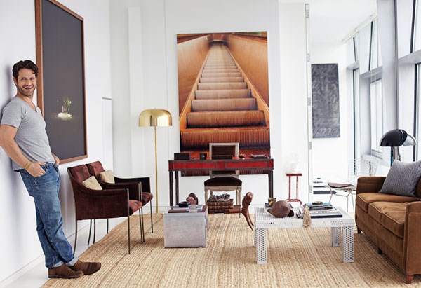
{via Decoist}
Honestly? What has taken me so long to post about Nate? I love Nate’s style. Have for SO long. Mr. Nate is one of my top three favorite design inspirations {my other two? Tyler Dawson and Katie Ridder}, and I am thrilled to tell you why.
But first… one more teensy thing. In two weeks, I am hopefully going to have the opportunity to tell Mr. Berkus how amazeballs he is. Ya know. FACE TO FACE!!! {I am totally calm. totally calm…} THE. NATE. BERKUS. is the Panel Host at this year’s Stylemaker’s event with Better Homes and Gardens in NYC. And lil’ ol’ me is going to be there…. tripping him “accidentally” in the hallway…. meeting him and thanking him for his amazing and inspiring design aesthetic.
{P.S. Why ditto?? As you pour over the following rooms, keep in mind the following design concepts that I believe make his spaces SOOOOO ditto-worthy! And don’t forget to think about what YOU would ditto from these spaces!}
Nate Berkus‘s spaces are ditto-worthy because of:
- his ability to edit like a BOSS!
- his awesome and regular use of velvet.
- his gift at making his spaces breathable and fresh.
- his knack of making beautiful, masculine spaces that have just the right touch of feminine.
- Drapes!He hangs a mean and lovely drape in nearly every room. Man after my own heart.
- his ability to mix simplicity and posh.
- his love for gold, velvet, and architectural impact. Sound like anyone you know?
- his ability to create interest with form and texture {he does not use much pattern, with the exception of bold stripes or checkers here and there}.
- his skill for making the understated to ‘read’ as drama.
- his use of wood in design. Can’t think of anyone who can touch Nate’s skill at incorporating wood variety and wood paneling into a space without making it heavy at all.
Not only is he a genius with space and design, Nate also wrote an inspiring book, that sits on the top of my coffee table, reminding me to decorate with what I truly love. I definitely recommend it.
{click here to buy The Things That Matter
via Amazon. This is an affiliate link. Thank you, lovelies!!}

Oh, Nate. You had me at velvet.
Feast on his ditto-worthy talent:
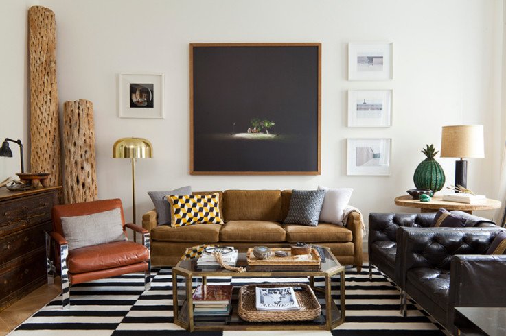
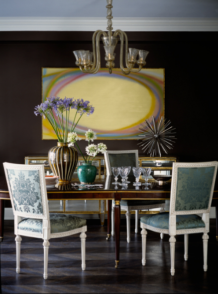
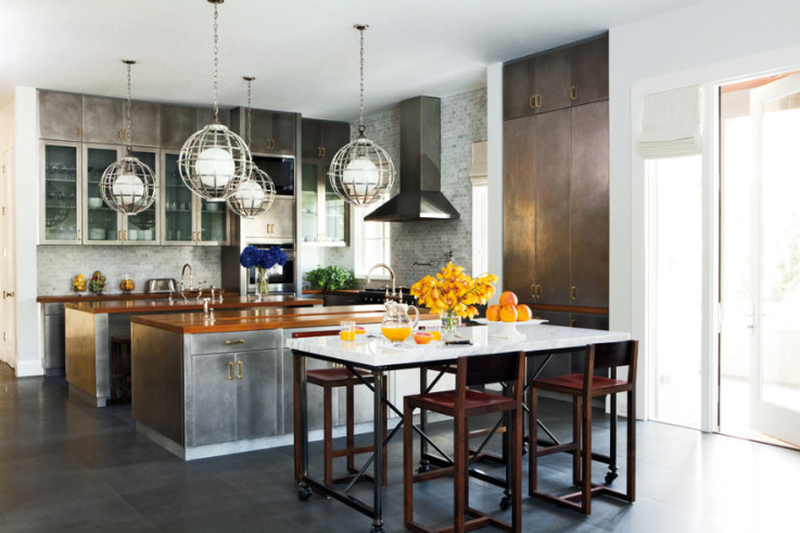
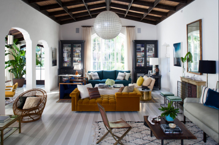
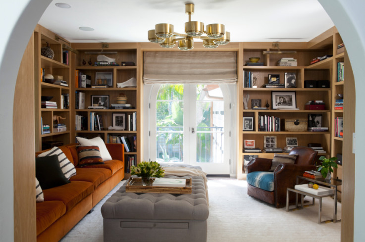
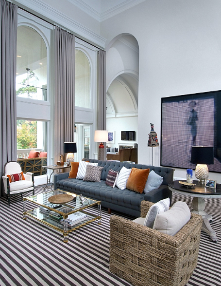
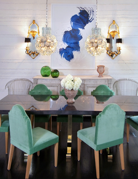
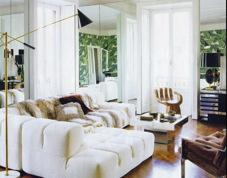
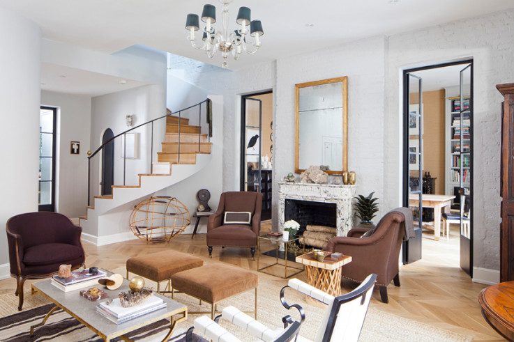
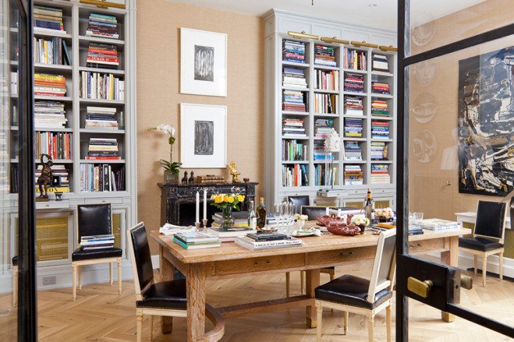
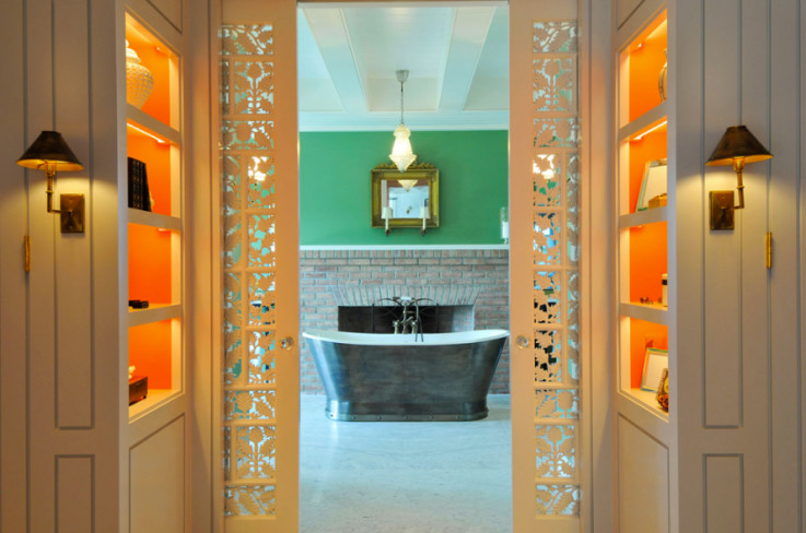
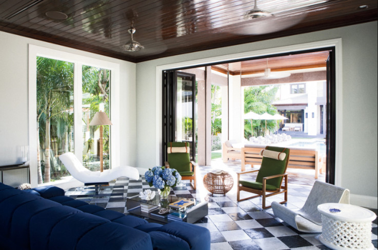
{all images via Nate Berkus’s Portfolio}
* * *
Which room is your favorite? Why?
What would you ditto?
Are you a huge Nate Berkus fan? Spill the beans.
Reminder!!! Today is the LAST day to enter the awesome Signature Style Giveaway!!! Go enter… quick! SUCH Gorgeous goodies to be had!!
* * * * *
Take daily, bite-size steps toward living in a home you LOVE: Be sure to subscribe to FHD via email, bloglovin, your fave reader, and follow Fieldstone Hill on Twitter, Instagram, and Facebook!
MY GENEROUS SPONSOR:
I am into natural choices for my family, and this is the main way I avoided taking any medicines during pregnancy, and now our family is hooked. My Young Living essential oils are also my business, and the oils are so well loved that they sponsor my blog!!! Thank you, friends! Be sure to check out the July freebie for trying the oils with a wholesale Premium Kit. Enroll by clicking here.
This post is generously sponsored by my YL :
Don’t miss a single post from Fieldstone Hill Design! Have regular decorating goodness delivered {free!} directly to your inbox.
{This post contains affiliate links. Thank you so much for reading and supporting FHD! }


I just LOVE his style and the first room is a favorite. He has the unique ability to add just the right amount of texture, style, and color to each room. Happy Monday and adored reading about our precious Georgia’s first birthday!
My favorite room of Nate’s isn’t shown here but I believe it’s his NYC apartment’s living room. His use of black trim on the windows is like an art form. The thing I believe that makes him most ditto-worthy is his use of meaningful objects. As you said, he edits, and what’s left has beauty and meaning. Be sure to ‘trip’ (um, I mean, greet) him for me, too!
Inspired by these photos, I spent some time “editing” today. Why I was hanging onto a cheap flea market vase I got for $2 and it had absolutely no soul, I have no idea, except I did like the shade of blue. So maybe it inspired me in its own way and now it’s time to let go and maybe someone else will pick it up and see possibility.
fhd press:
FHD’s popular posts
sponsors I love
peruse
shop like it’s your job
FHD in blogland
categories
31 Days of Favorite Spaces A room I love about me Affordable Designer Rooms beautiful colors beautiful thoughts Bebe bebe bebe nursery before and after BHG blogland built-in of the Week client spaces contrast decorating yourself defining your style design boards design in progress design question ditto ditto d.i.y. ditto-worthy designers en masse farmhouse simplicity five faves for a song from my files here at Fieldstone Hill hiding the uglies high-gloss glamour Home tour Images Of inspiration Inspired to lessons in design living with beauty Living with Beauty: Beauty Tips and Tricks Living with Beauty: Wellness Living with Beauty: Whole Food Eating Living with Beauty: Within Master Designer mixed metals must have objects organizing overcome decorating paralysis project project kitchen project library project nursery punch color renovation rituals room by room sponsor style notebook traditions trends Uncategorized vision
Archives
Theme by Design by Kendall