Monday, May 23, 2011 by {darlene}
A bit of info to attend to before we get busy looking at beautiful design inspiration:
- This week, I am starting a summer posting schedule. I will be posting regularly on Mondays, Wednesdays and Fridays. But don’t count me out on the other days of the week. I may get a ‘wild hair,’ {which one should never keep to oneself}. Summer is just a flash in the pan, and I intend to sit on my patio a bit, sip mint iced-tea, and watch my little guys get dirty. Oh. and work hard on client projects.
- Wow, only T-minus NINE days and counting to purchase Design Services at my super-reduced rate. I wish I could keep these rates so scrumptious all the time, but ‘she works hard for that money.’ Ask my clients! I promise, I work my little tushy off for you! but it’s love.
Now. Onto the ever FUN task of ditto-ing our Mondays away!!
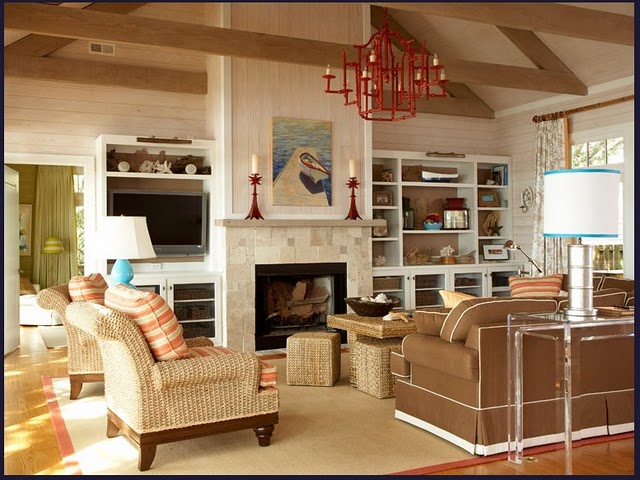
What a great way to start the week: with a ditto that studies an overwhelmingly inspiring living space by Amanda Nisbet. I simply LOVE this living room:
- An amazing set of super-stylish bookshelves. I love the modern, streamlined look of the crisp white wood, contrasted with the rich, warm brown painted on the back bookshelf wall. And I love the bold shape of each shelf. Not a touch of fluting or molding in sight.
- A TV hidden in plain sight. Amongst the darker-backed shelves, even a huge television looks to be blended-in. This could be achieved with nearly any deep paint color. I highly recommend.
- Gallery lighting that sits along the top trim of each side of the bookshelves. Check out those sleek, brass little numbers. Not only is this practical, handy, and beautiful; it is genius. And it plays right into the slick look of the shelves.
- A to-die-for, attention-seeking, center-stage, gutsy chandelier. Makes the room. Period.
- Punch colors abound. A glossy red chandelier ties in with two, stunning, red candlesticks, and a strong line of red in the art. An aqua lamp ties in with an aqua-banded lampshade, and decorative bowls of aqua among the bookshelves. Even the honey colors of natural wicker could be considered a punch color in this room.
- Piping. How I love thee. And how lovely your crisp, white band looks upon a toffee colored sofa. And, oh my, you look extra wonderful with the thick band of white that encircles the sofa’s tailored skirt. Pure, refined loveliness.
- Natural touches and textures abound. Sisal. Coral. Wicker. Cotton. Bamboo. All working in happy, natural harmony with one another. I just love that about this room. And, I happen to be a sucker for lots of wonderful, varying textures; you cannot find more beautiful textures than those created in Creation.
- A Coffee table and ottoman combo. Lately, I have been drawn to the idea of keeping a few small benches tucked under your coffee table. Even better if they are contrasting in style, and peeking out to add some additional beauty to the room. Here, the wicker table and stools do not contrast, but the function of it all is so wonderful. It is an ingenious use of space and furnishings. You can go from Proper to Party in 0 to 60.
- Barn siding: North and South. Barn siding: East and West. Above the mantle, the barn siding draws the eye upward. Above the bookcases, the barn siding pulls the eyes outward. And the best part is, the texture-power is doubled and is made even richer with this brilliant use of siding.
All in all, this space is gorgeous in form, feel, and details.
What would you ditto from this space?
– {darlene}


My eye was immediately drawn to the light fixture! I love the bold color.
beautiful!
hey…can you do a post on showing various school room options..espeically for organizing things. yikes…i don't know where to start!
I love this room… the bookshelves caught my attention and I didn't even notice the TV! Beautiful and casual all in one.
fhd press:
FHD’s popular posts
sponsors I love
peruse
shop like it’s your job
FHD in blogland
categories
31 Days of Favorite Spaces A room I love about me Affordable Designer Rooms beautiful colors beautiful thoughts Bebe bebe bebe nursery before and after BHG blogland built-in of the Week client spaces contrast decorating yourself defining your style design boards design in progress design question ditto ditto d.i.y. ditto-worthy designers en masse farmhouse simplicity five faves for a song from my files here at Fieldstone Hill hiding the uglies high-gloss glamour Home tour Images Of inspiration Inspired to lessons in design living with beauty Living with Beauty: Beauty Tips and Tricks Living with Beauty: Wellness Living with Beauty: Whole Food Eating Living with Beauty: Within Master Designer mixed metals must have objects organizing overcome decorating paralysis project project kitchen project library project nursery punch color renovation rituals room by room sponsor style notebook traditions trends Uncategorized vision
Archives
Theme by Design by Kendall