Monday, February 28, 2011 by {darlene}
{Well, the announcement that I mentioned last Friday will have to wait… I need to get better at that pesky HTML. But, never fear, it is still on its way.}
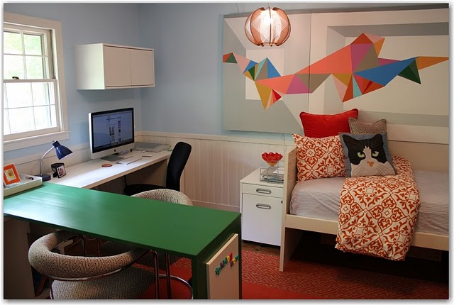
So, what better way to start the week than with a ditto? And what better way to be inspired than by heading back over to Angela’s home to discover what is so wonderful about her study/schooling space? Angela’s study has more mid-century and modern {you know how I don’t like those decor classification words. ugh} influences than I usually feature, so let’s have some fun!
ditto :: {what I would steal from this space}:
- an amazing Power Painting as a focal point. This works so well in a study, where one must be prolific and sit still too- despite the weather or your mood. Having an energetic piece of art, that draws you immediately into your imagination, is perfect inspiration in a study. And growing minds should be surrounded by art.
- punch color! a lot of it. and brave color. I love bright and gutsy colors in children’s spaces and studios. do you have the courage to paint a desk in bright kelly green? and then add splashes of strong orange? supported by sweet blue on the walls? go for it. And don’t miss how the orange punch color is woven beautifully throughout the room in little and big ways.
- Varying learning surfaces. Having several stations where different kinds of work can be done is brilliant. I love that, when working at the green desk, you don’t have a computer in your face like most desk situations offer. This frees the mind!
- gorgeous lighting. I love that woven pendant. Don’t save all of your beautiful fixtures for the foyer. no! put them where you will enjoy them much throughout the day.
- See that magnetic wipe-board on the end of the desk? all surfaces are fair game. Always make creative and useful use of your space, and ‘stuff’ will never rule your space. Instead, artfully incorporate the elements that are necessities. Why can’t a wipe-board look beautiful? I love that the location of this wipe-board encourages sitting comfy criss-cross-applesauce on the floor.
- that cat pillow. meow. I love that this room does not take itself too seriously. Learning is about having fun, is it not?
- the half-moon mid-century chairs. I love this idea for kiddo chairs. Yes, I am stealing that one.
- fun pattern, but not too much. I love the balance of pattern in this space. The rug and the upholstered chairs offer a small geometric pattern, while the bedding offers a bold and attention-getting pattern. The patterns do not “matchy match,” but instead, work together brilliantly. And they draw you into the focal point of the art, instead of detracting.
- the day bed. Don’t you want to snuggle up with a book? Really wishing I had space for a daybed in our study!
Our design goals for 2011 include creating a school room for our family. I will definitely be using Angela’s fantastic study as an example of a great use of space.
happy Monday!
-{darlene}
{Fieldstone Hill Design is a brand new blog, and my dream! Thank you to everyone who is cheering me on. Love Fieldstone Hill? thanks. you rock. Would you consider sharing the love by Following {click Follow in the right sidebar}, Liking on Facebook, or linking here from your blog. I just knew you were awesome!}


You always find the prettiest spaces to feature. Such a great learning environment and stylish too!
Darlene, a great image, love the art of course!!
Really the design is superb!
Join my Artfful Offering and Read a great Interview at my site.
xoxo
Karena
Art by Karena
Thank you, Darlene–what a fun surprise! You perfectly put into words the room–and stuff I probably didn't even know I was doing, ha! I'm all like, "look at this new room [insert goofball laugh]" but you take it a step further with all your astute observations and tips to ditto.
fhd press:
FHD’s popular posts
sponsors I love
peruse
shop like it’s your job
FHD in blogland
categories
31 Days of Favorite Spaces A room I love about me Affordable Designer Rooms beautiful colors beautiful thoughts Bebe bebe bebe nursery before and after BHG blogland built-in of the Week client spaces contrast decorating yourself defining your style design boards design in progress design question ditto ditto d.i.y. ditto-worthy designers en masse farmhouse simplicity five faves for a song from my files here at Fieldstone Hill hiding the uglies high-gloss glamour Home tour Images Of inspiration Inspired to lessons in design living with beauty Living with Beauty: Beauty Tips and Tricks Living with Beauty: Wellness Living with Beauty: Whole Food Eating Living with Beauty: Within Master Designer mixed metals must have objects organizing overcome decorating paralysis project project kitchen project library project nursery punch color renovation rituals room by room sponsor style notebook traditions trends Uncategorized vision
Archives
Theme by Design by Kendall