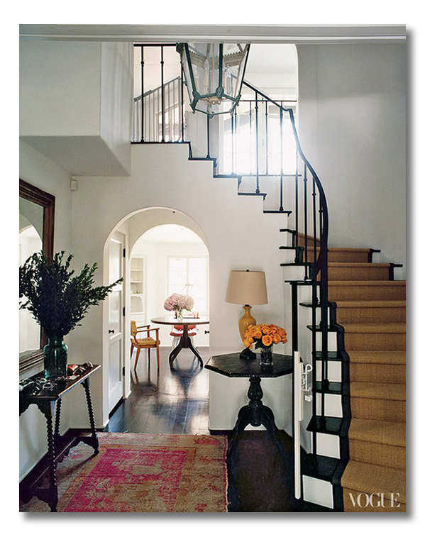
Today’s ditto | a room I love post features a soaring, grand foyer that has drops of color-fun around the space.
{Ditto | Room I Love posts demonstrate a great exercise for you as you continue to develop your own personal style: using your own favorite pictures, and making a quick list of what you actually love about the space. If you study what you love about a space, it helps you to bring what you LOVE into your own home!}
Enjoy this grand foyer, and the quick “ditto” list of why I love it.
So. Do you love it?:
{The home of Amanda Peet , via Vogue}
WHAT I LOVE {What I would ditto!}:
1. Without hesitation, the antique oushak rug in FUCHSIA. Are you kidding me? Gorgeous. Look how it is worn and well-loved from the years. This imperfect rug is just perfect in my book. Not to mention the color and life it adds to this space…
2. The drop of melon-orange in the lamp. Another lovely splash of color.
3. The drop of aqua in the lantern. Another lovely splash!
4. The otherwise neutral palate made grand by all of the contrasts of dark and white. White walls, dark floors. Dark stairs, white risers. Deep mahogany furnishings against the white walls.
5. Tables in the foyer. Beautiful tables with places to rest your keys, or put your pocketbook as you check the mirror on your way out of the door.
6. The carpeting on the stairs, a simple sisal with a black tape edge. The perfect combination of practicality and beauty.
7. Fresh, abundant bunches of flowers – all of the same kind, overflowing a vase. My favorite! This can even be done with bunches of same-kind grocery store flowers.
DO YOU LOVE IT?? WHAT DO YOU LOVE? WHAT DESIGN ELEMENTS WOULD YOU DITTO IN YOUR OWN HOME? DO TELL!!!!!!
* * * * *
I love the Valentine’s Cards at Minted! Especially their CUTE kids’ classroom cards
* * * * *
Are you a One Kings Lane Member? Pretty. Amazing. Stuff. I tell ya. Click on the image below to sign up for exclusive sales:

* * * * *
Don’t miss a single post from Fieldstone Hill Design! Have regular decorating goodness delivered {free!} directly to your inbox.
{This post contains affiliate links. Thanks for reading and supporting FHD! }


So excited that you chose this one this morning! I have this one pinned 🙂 Yes, LOVE the fuchsia rug! (which I now always spell correctly thanks to you) And every other ditto you named. I know it’s more part of the architecture than the design, but I love curved staircases! And, what appears to be, an iron or some sort of metal balustrade. Such a breath of fresh air when everything else is wood.
I meant to also add that I’ve been thinking for a year or two about putting exactly this type of runner on my staircase. Do you think the style will be around long enough? I started to think lately that maybe it’s already passed?
I think a basic sisal is timeless. And a black border is as well!
I do love it! I think I would ditto EVERYTHING! Love the contrast.
I love the hanging lantern. That patina look is so comfortable.
And I like the tables. I don’t like dark wood, or stark contrasts, so I’d probably tone it all down a little, but the shape of the tables is pretty.
Unfortunately, those flowers would die and rot before I ever got around to replacing them. And then one of my little kids would knock them off, getting broken glass, musty water, and moldy flowers all over the floor. Then they’d walk in it and track it up that sisal staircase. I’m a few years from this look!
The first thing I noticed were the shapes…the arches, the shape of the table, the geometry of the stairs. Not so much the colors, but definitely the shapes in the room. I have a “grand foyer” or “reception hall” and it doesn’t look this nice…yet LOL
fhd press:
FHD’s popular posts
sponsors I love
peruse
shop like it’s your job
FHD in blogland
categories
31 Days of Favorite Spaces A room I love about me Affordable Designer Rooms beautiful colors beautiful thoughts Bebe bebe bebe nursery before and after BHG blogland built-in of the Week client spaces contrast decorating yourself defining your style design boards design in progress design question ditto ditto d.i.y. ditto-worthy designers en masse farmhouse simplicity five faves for a song from my files here at Fieldstone Hill hiding the uglies high-gloss glamour Home tour Images Of inspiration Inspired to lessons in design living with beauty Living with Beauty: Beauty Tips and Tricks Living with Beauty: Wellness Living with Beauty: Whole Food Eating Living with Beauty: Within Master Designer mixed metals must have objects organizing overcome decorating paralysis project project kitchen project library project nursery punch color renovation rituals room by room sponsor style notebook traditions trends Uncategorized vision
Archives
Theme by Design by Kendall