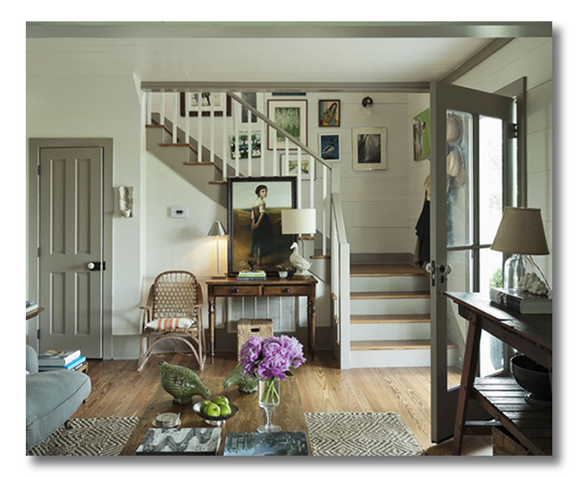
Today’s ditto | a room I love* post features a farmhouse-lovely entryway.
*{Ditto | Room I Love posts demonstrate a great exercise for you as you continue to develop your own personal style: using your own favorite pictures, and making a quick list of what you actually love about the space. If you study what you love about a space, it helps you to bring what you LOVE into your own home!}
Farmhouse-lovely and farmhouse-classy, this entryway is inviting, warm, and strikingly beautiful. Pure lines and edited choices allow this space to breathe.
This is a room I love. Do you love it?:
{via Shannon Berry Design, design by Ashley Putnam}
WHAT I LOVE {What I would ditto!}:
1. The gray-green-beige greige trim. Such a fantastic color that highlights the beautiful historic architectural elements. I love how it was also used on the stairs.
2. All of the wood finishes that keep things pure.
3. Glass panes in the front door let in light.
4. Attention to detail with authentic doorknobs.
5. A controlled and classy gallery wall that features breathing room between pictures and much white matting for more breathing room.
6. The layered foyer entry table, layered with decor above and a small storage basket beneath.
7. A simple yet lovely place to sit. Every entryway needs at least a tiny spot to tie shoes or toss down your bag.
8. The natural fiber rug with a touch of modern: the geometric diamond pattern.
9. The foyer table conceals the large HVAC intake.
10. Real green apples and bright flowers mean everything to this space!
DO YOU LOVE IT?? WHAT DO YOU LOVE? WHAT DESIGN ELEMENTS WOULD YOU DITTO and BRING INTO YOUR OWN HOME? DO TELL!!!!!!
Follow Fieldstone Hill on Twitter, Instagram, and Facebook! Can’t wait to see you there.
* * * * *
* * * * *
Fieldstone Hill’s Interior Designs are going to be included in Kelly Edwards’s new design book. Preorder your copy here.
* * * * *
Don’t miss a single post from Fieldstone Hill Design! Have regular decorating goodness delivered {free!} directly to your inbox.
{This post may contain affiliate links. Thanks for reading and supporting FHD! }


I do I do!!! My faves- the natural rug, bright flowers on the coffee table, art wall, and the simplicity of the stairs. Beautiful!
Dearest Darlene,
I so want to ditto the duck lamp. But here’s my fear – is it the painting that makes the duck lamp work? Would a duck lamp look dorky if the room wasn’t as swoony as that room? Does it work because the room isn’t filled with ducks and birds, so it is the novelty piece amidst fine, classic pieces?
I’m going to think about that duck lamp all day now. 😉
xoxo michele
I know!! Love that CUTIE lamp and how it is white {bet it was not white to start!}
is it the painting that makes the duck lamp work? not necessarily.
Would a duck lamp look dorky if the room wasn’t as swoony as that room? that is certainly a possibility!
Does it work because the room isn’t filled with ducks and birds, so it is the novelty piece amidst fine, classic pieces?
I think it is because it is amidst fine classic pieces, although if there were a few more classy ducks, that would not break the room, I don’t think.
All that said, you know how I feel: I don’t think we should be boxed in by rules. None of these are rules! BUT I {emphasis on the I} feel that restraint and editing ALWAYS helps the gorgeous pieces shine!
I do love this room. The thing that stands out most to me is the “feel” of the room. It looks so comfortable and like you’d feel at home as soon as you walked through the door. I love the trim color and wouldn’t have noticed it until you pointed out the table hiding that ugly intake vent. Great idea. Of course with all those neutrals, the color of the flowers and apples really brightens up the space.
Yes, I love it! Ditto to everything you said (although I didn’t catch it all before I read your dittos – never observant enough!). I love that particular grey…looks just like my kitchen cabinets and it’s so perfect because it “goes” with just about any other color. I love the way that large painting is propped on the table, too! Didn’t even notice the air return until you mentioned it.
I love how simple it is, and great point about the breathing room in the gallery wall. I love the entry table, but my favorite part might be the humor of the birds on the coffee table. It looks like they are pecking at the apples. 🙂 Gorgeous find!
I loved it right away. Then after a few minutes I realized that it is so similar to my own home. The walls and trim are almost exact matches, but my wall color is a little more creamy, almost looks like vanila ice cream when the sun hits it. I love it! The natural wood furnishings, the natural rug, all just like mine, too. That little green sofa that only shows a little…now that I would love to add to mine. Love that green. I’ve gotta keep an eye for something like that.
The warm woods and those painted doors for sure!
fhd press:
FHD’s popular posts
sponsors I love
peruse
shop like it’s your job
FHD in blogland
categories
31 Days of Favorite Spaces A room I love about me Affordable Designer Rooms beautiful colors beautiful thoughts Bebe bebe bebe nursery before and after BHG blogland built-in of the Week client spaces contrast decorating yourself defining your style design boards design in progress design question ditto ditto d.i.y. ditto-worthy designers en masse farmhouse simplicity five faves for a song from my files here at Fieldstone Hill hiding the uglies high-gloss glamour Home tour Images Of inspiration Inspired to lessons in design living with beauty Living with Beauty: Beauty Tips and Tricks Living with Beauty: Wellness Living with Beauty: Whole Food Eating Living with Beauty: Within Master Designer mixed metals must have objects organizing overcome decorating paralysis project project kitchen project library project nursery punch color renovation rituals room by room sponsor style notebook traditions trends Uncategorized vision
Archives
Theme by Design by Kendall