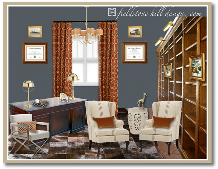
My latest design board was a wonderful project, helping my client to create a relaxing gentleman’s library for her hard working husband.
He needed a relaxing haven to give him a rest from his emotionally heavy occupation of oncologist. It was such an honor for me to help this family create a space that would meet that need:
What I love about this space:
1. The fantastic brazilian hide rug.
2. The rust orange that is woven throughout.
3. Those Ralph Lauren helmet lamps.
4. Gorgeous built-ins, topped with horizontal portrait lighting.
5. The gold animals!
6. Fantastic prints that warm up the space, but are certainly still perfect for a gentleman.
7. The wingback chairs provide a great spot for two to curl up with a book for the evening.
8. The modern-edge, white leather comfort desk chair that gives a streamlined look to a traditional desk.
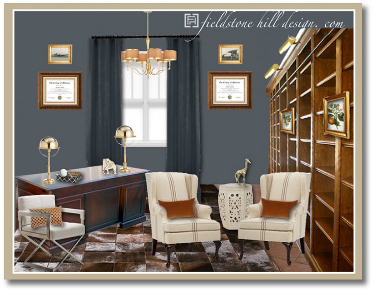
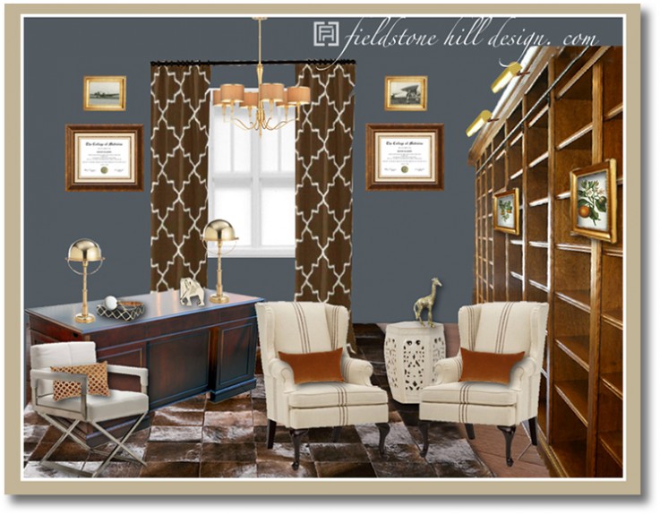
My client and I had fun playing around with different curtain options.
I thought it would be fun to see which one you all like the best: 1. orange, 2. blue, or 3. brown??? Each one gives the room a bit of a different feel. I can’t wait to hear which fabric gets your vote!:
Once again, the beauty of a vision design board: my client was so thankful to see the entire room plan PRIOR to making her purchases, so that she could move forward with confidence, knowing that the room would pull together with each room element she adds.
I can’t wait to see which drapes my clients select for this gentleman’s library!
What do you think of this eDesign? And, which curtain panels do you love best? I love hearing your thoughts!
* * * * *

* * * * *

Don’t miss a single post from Fieldstone Hill Design! You can have every post delivered directly to your inbox. It is free, and your email is never used for another purpose.
be sure to check your email, confirm your subscription, and get your freebie link!
If the subscribe box does not work click here to go to the Fieldstone Hill Design page and submit in the right sidebar.
{this post contains affiliate links}


I love this! I think the rust coloured drapes are the best. Orange is one of my “go to” colours, though, so I may be biased. The blue is too quiet and the brown are OK: but I’m thinking “too trendy.” I think the scale of the brown ones is too big, too, but that’s not a decision I can make looking at an inspiration board!
thanks, alana!
Definitely the rust draperies! I’ve used the rusty orange along with a deep blue and light golden yellow in my husband’s home office and love it! It gives the room a warm energy and a little zip.
hands down first drapes
Love them all, but the last ones are fabulous!!
thank you!!!
Its just beautiful Darlene! I vote orange drapes.
thanks, amanda, stylish lady!!!!!!
The first ones for sure! Great room!
thanks, kristen!!
Although all three are fabulous in their own way.. My vote is for the orange. (1st) You did a super fabulous job, Darlene!… as ALWAYS!!
thanks, kristy! I lurve you!!!!
My vote is definitely for the burnt orange drapes. They seem to bring the most life to the room which is beautiful, by the way!
thank you, paula!!!
Oh my goodness, this is so gorgeous. Somehow you managed to make the room both handsome and pretty — if that makes sense? My vote would be for #1, too, swooning over that orange. Happy weekend! 🙂
Thank you so much, Heather! What kind words!! Happy weekend to you too!
#1 the orange is my favorite. Jazzy!
They’re all beautiful options, but the orange ones are my fave! Excited to hear what your client picked…
-Kristen
Thank you, Kristen!
My vote is for option #2.
I’m drawn to the tonal blue effect of the painted blue wall and the similar blue colored drapes. To me the doctoral awards and college degrees are the focal point of the wall on this side of the room. I can see the number of frames displayed multiply over the years to come. Maybe even incorporating photographs… a real memory wall. Don’t get me wrong I’m so into the color orange… my husbands office is loaded with orange. Bring the curtain detail as high up as possible and ADD THE ORANGE COLOR with Box Pleated Valances with Buttons??? {like on http://www.houzz.com/box-valance}
I have 2 identical sets of answers for you. I ran this by my husband who also has a Gentlemen’s Library. I didn’t give him my answers first. We came up with the same decision..
1. Rust Orange ~ definitely! Like that they’re “rust” orange too & not super bright.
2. Brown ~ love this too, but the orange has the edge.
3. Blue ~ way less personality & a little too monochromatic for “us”.
That was fun!
I’m glad to see all the votes for the first one since that what we picked! The rust/orange just works so well with the navy. We love this room and though its not quite done, it’s already amazing. The lighting darlene found us for the built-ins and ceiling and the wall color alone are major WOW. Pictures will come when complete : ) Thanks Darlene for all your work on this space!!! My husband spent the other evening in there reading his Bible after a hard day. blessing!
Thank you Sarah! This means so much to me!! I am so thrilled that you are loving your space. We all can’t wait to see the end result!
I’m voting for curtains number 1. Love the contrast.
I can’t believe I’m going to say this because orange isn’t on my radar at all; but with the blue gray walls, the complimentary shade of orange drapes and the orange pillows on the white chairs is my favorite color choice.
Out of the three, I’d go with the rust. Would have enjoyed seeing the blue in a geometric rather than plain!
I vote for the contrast, the orange ones. Second choice, brown. Orange brings more energy to the room, more creativity, which you need in a study!
I like the first ones because the color goes so well with the wood, warm and bright. The blue ones aren’t bad, they just sort of fade into the wall. The last ones I like the bold white pattern because it echoes and balances the other white in the room. The chairs and trash bin are light and the certificates on the wall are light, giving this sort of U of white. having just a little bit of it on those curtains sort of connects across that wide expanse.
So I like the first and last ones both, but the first ones a little bit better because the color is so nice and warm.
Another beautiful room, {dar}! I’m with the majority here, too-rust. 🙂
[…] is a design board that I finished a while ago with a beloved client, Sarah. {We have done her library, her keeping room, and her living room so far} It was so fun to execute a fun and functional […]
fhd press:
FHD’s popular posts
sponsors I love
peruse
shop like it’s your job
FHD in blogland
categories
31 Days of Favorite Spaces A room I love about me Affordable Designer Rooms beautiful colors beautiful thoughts Bebe bebe bebe nursery before and after BHG blogland built-in of the Week client spaces contrast decorating yourself defining your style design boards design in progress design question ditto ditto d.i.y. ditto-worthy designers en masse farmhouse simplicity five faves for a song from my files here at Fieldstone Hill hiding the uglies high-gloss glamour Home tour Images Of inspiration Inspired to lessons in design living with beauty Living with Beauty: Beauty Tips and Tricks Living with Beauty: Wellness Living with Beauty: Whole Food Eating Living with Beauty: Within Master Designer mixed metals must have objects organizing overcome decorating paralysis project project kitchen project library project nursery punch color renovation rituals room by room sponsor style notebook traditions trends Uncategorized vision
Archives
Theme by Design by Kendall