Contrast is King
Here is some Sunday morning inspiration for you!
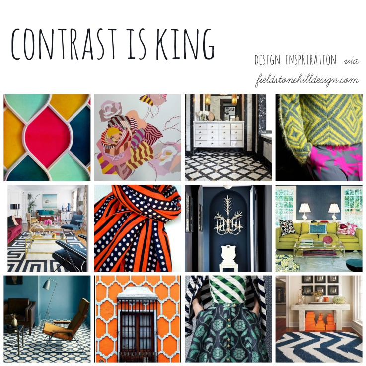
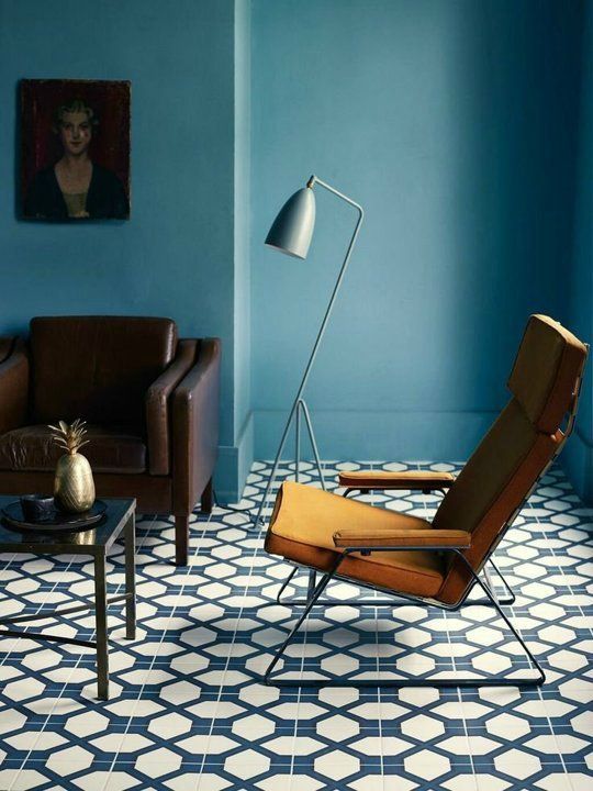
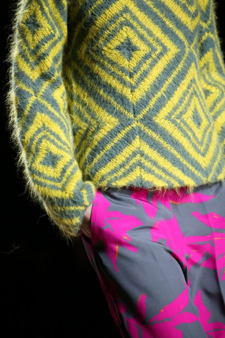
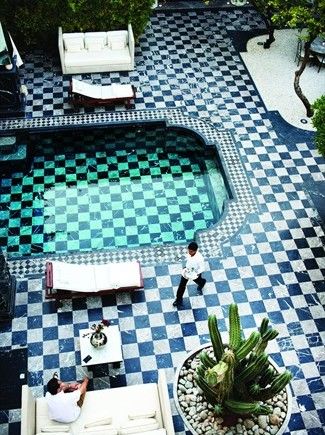
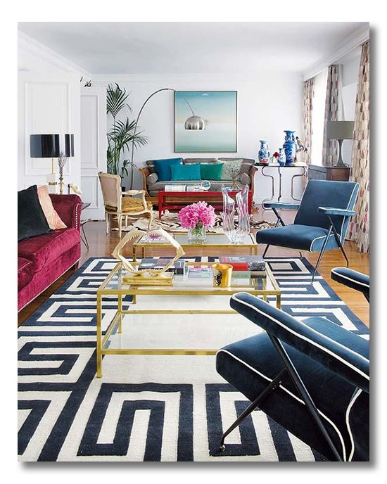
Contrast is a POWERFUL design tool. There are lots of ways you can drum up contrast:
- contrasting colors (on the color wheel),
- contrasting black vs. white,
- contrasting pattern vs. plain,
- contrasting textures,
- contrasting sizes, etc.
I have designed my entire kitchen project with a main goal of creating contrast.
I wrote a post that I still love, all about contrast and why I am SO crazy for it. I think, if you love the pics below, you should check it out: Lessons in Design: The Power of Contrasts.
Are you using CONTRAST in your home? If not, I hope these pics will get you thinking about ways you can add strong pops of contrast for a bold effect in your spaces. I encourage you to give it a try.
Here is a collection of my latest/greatest FAVE “Contrast” inspiration (many of which have directly inspired my evolving Project FHD Kitchen. These spaces are brilliant examples of well-executed contrast in design:
{find these graphics/sources, and more, on my Pinboards: My thing for Contrasts, My thing for bold patterns, My thing for Contrast Piping, Fieldstone Hill Kitchen Renovation, Inspiration Bathrooms, Inspiration Kitchens}
{Pin this graphic:}
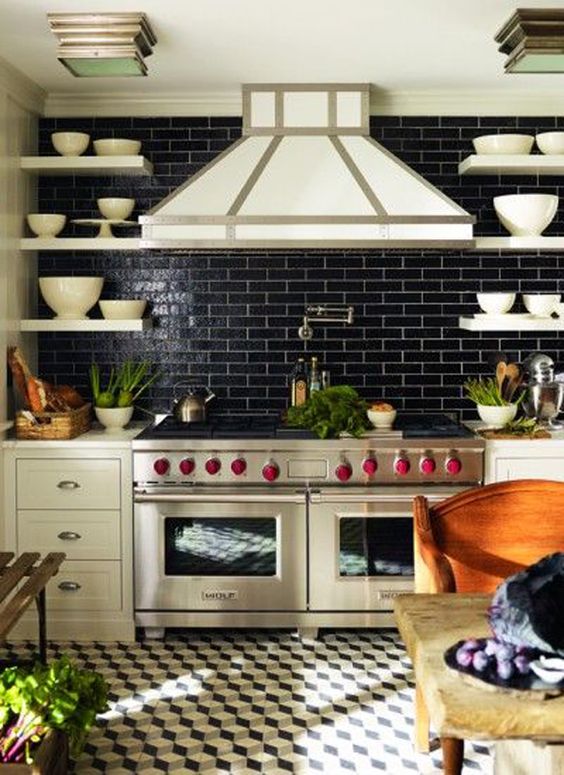
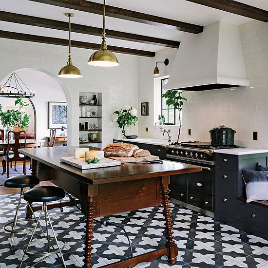
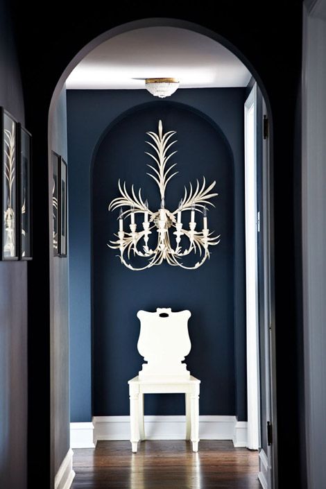
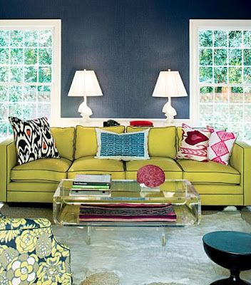
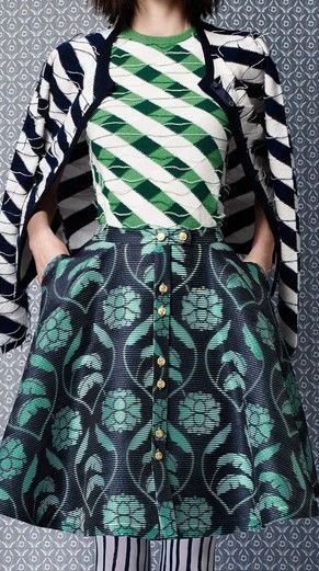
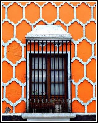
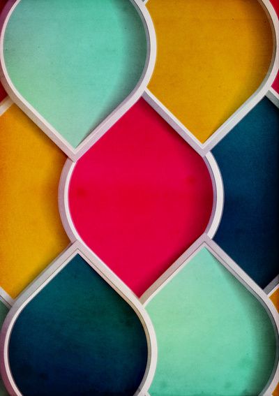
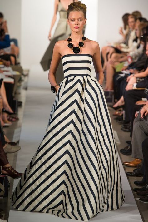
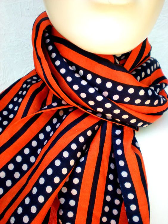
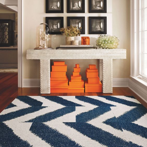
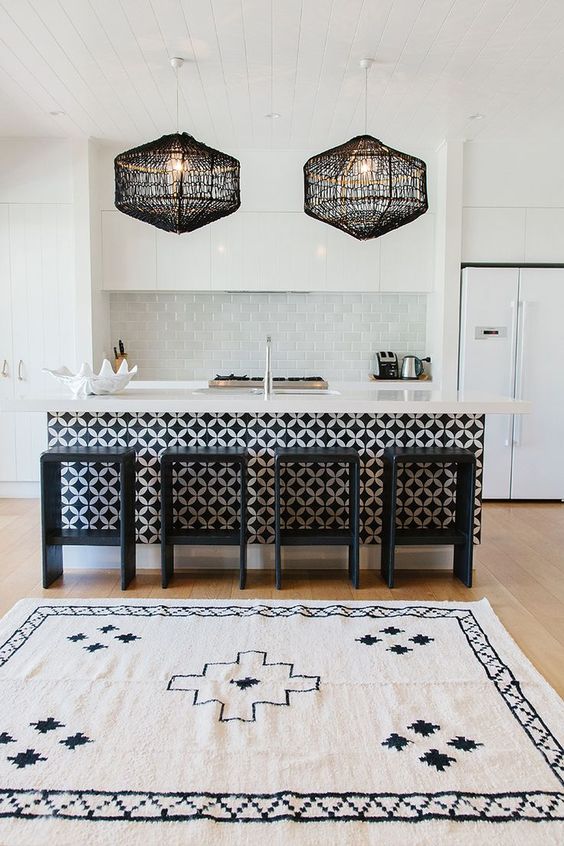
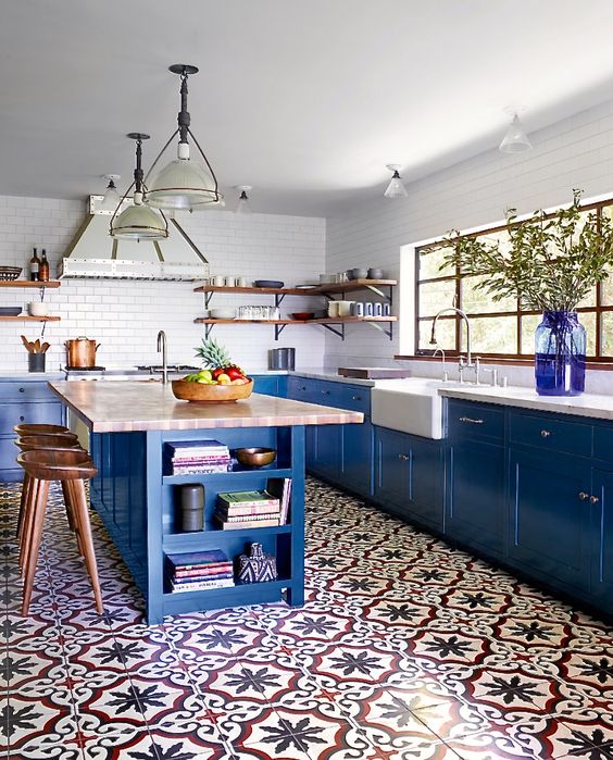
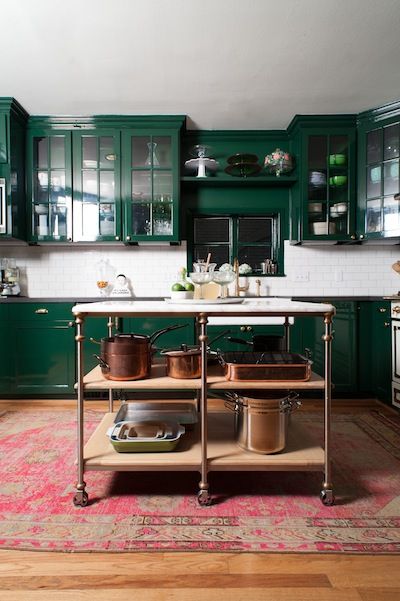
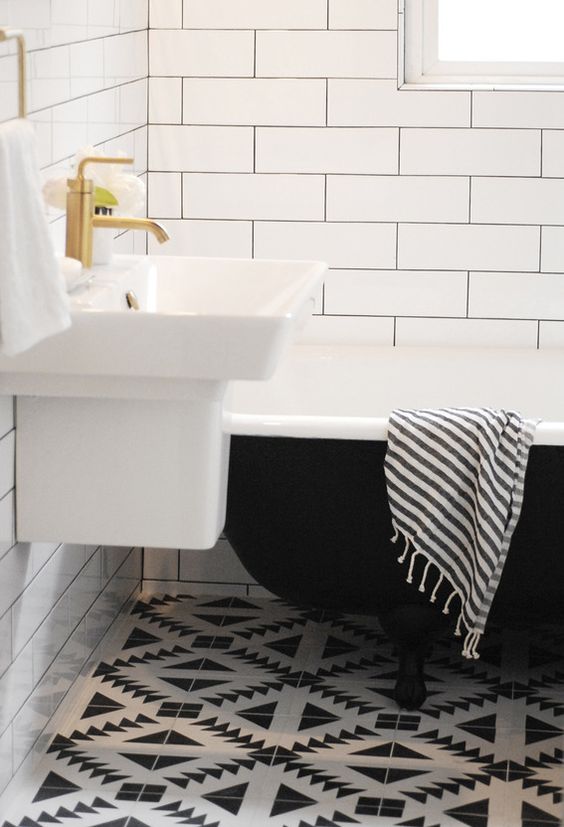
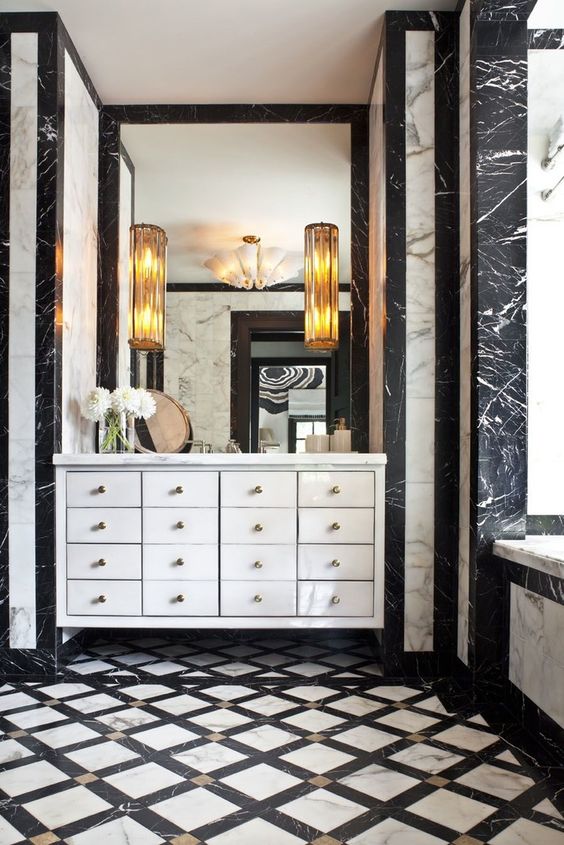
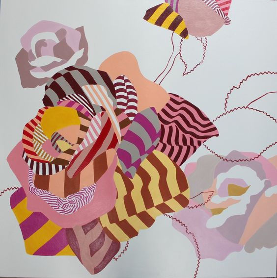
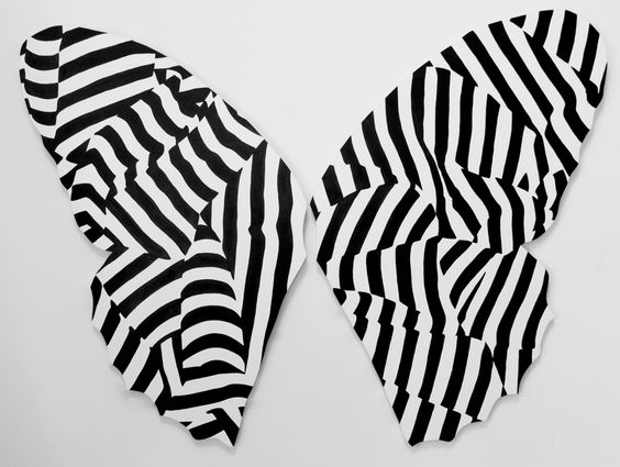
{^^^^ those last two amazing pieces of art can be found here, and the artist can also be found here}
Tell me your thoughts!
Where do you already have contrast in your home?
Where can you add some contrast?
MY GENEROUS BLOG SPONSOR:
This blog post is generously sponsored by my YL. My Young Living essential oils are also a passion of mine, and the oils are so well loved that they sponsor my blog!!! Thank you, friends! Enroll by clicking here. You will not regret it! You NEED these amazing bottles of life-loving oils (that don’t even COMPARE to the cheap-y stink oils) in your life!!
I am SUPER excited about the new Premium Starter Kit. You are going to LOVE it… unless you hate things that smell heavenly and make you smile. #spaliving #livewithbeauty #wellness #MyHouseSmellsLikeASpa
Questions? Because I know you are curious!! Head here:
*****
Take daily, bite-size steps toward living in a home you LOVE: Be sure to subscribe to FHD via email, bloglovin, your fave reader, and follow Fieldstone Hill on Twitter, Instagram, and Facebook!
* * *
Don’t miss a single post from Fieldstone Hill Design! Have regular decorating goodness delivered {free!} directly to your inbox.
{This post contains affiliate links. Thank you so much for reading and supporting FHD! }


Oh my word, that stack of Hermes boxes. . . don’t they look beautiful on display there? Beauty is everywhere.
So when do we get to see photos of your high-contrast kitchen??
Hi there,I read your new stuff named “contrast is king (and why I am crazy for it) – Fieldstone Hill Design” regularly.Your writing style is witty, keep doing what you’re doing! And you can look our website about free ip proxy.
fhd press:
FHD’s popular posts
sponsors I love
peruse
shop like it’s your job
FHD in blogland
categories
31 Days of Favorite Spaces A room I love about me Affordable Designer Rooms beautiful colors beautiful thoughts Bebe bebe bebe nursery before and after BHG blogland built-in of the Week client spaces contrast decorating yourself defining your style design boards design in progress design question ditto ditto d.i.y. ditto-worthy designers en masse farmhouse simplicity five faves for a song from my files here at Fieldstone Hill hiding the uglies high-gloss glamour Home tour Images Of inspiration Inspired to lessons in design living with beauty Living with Beauty: Beauty Tips and Tricks Living with Beauty: Wellness Living with Beauty: Whole Food Eating Living with Beauty: Within Master Designer mixed metals must have objects organizing overcome decorating paralysis project project kitchen project library project nursery punch color renovation rituals room by room sponsor style notebook traditions trends Uncategorized vision
Archives
Theme by Design by Kendall