This week, I have been musing on the design concept of using, what I call, a “punch color.” And also, how to pick the punch colors that you love.
For those of you who are still not sure what a punch color is after reading these posts: {“the punch color, part one“; and “how to pick your punch colors“}, I thought a little photographic lesson would be helpful. Oh, and fun!
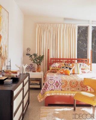
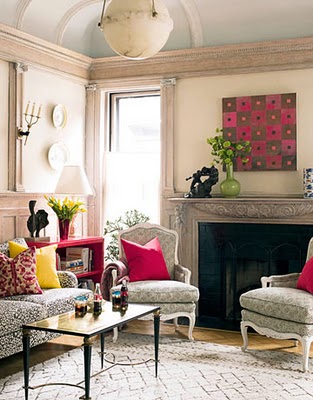
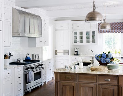
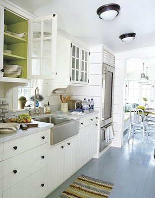
Looking at the following photos, we can identify the punch color or punch colors used in the space, and start to get an idea of why using punch colors is a more accessible and affordable way to use color:
punch color :: yellow:
used in the artwork, a vase, the main color of the bedding, throw pillows, a small upholstered piece, and strategically placed books.
secondary punch color :: orange:
used on the headboard, in the bedding, and in the books.
punch color :: pink:
used in the artwork, throw pillows, a painted side table, and a vase.
secondary punch color :: Yellow-green:
used in the flowers, the vase, and the pillow.
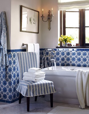
punch color :: blue:
used subtly in the curtains, the teapot, the flowers, the dish towel, the dishes and a few items visible in the glass-door cabinets.
punch color :: citrus:
used in the interior paint of the glass-door cabinets, the displayed fruit, the rug, the hand soap, and the plants.
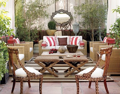
punch color :: red:
used in just a few places in this outdoor space, it still makes an impact: in the pillows, the painted lanterns, and even the fruit and the wine.
For more ‘beautiful colors’ posts, click here.
For more ‘punch color’ posts, click here.
And thank you to everyone who is cheering me on in my dream of Fieldstone Hill Design.Love Fieldstone Hill? thanks. you rock. Would you consider sharing the love by Following {click Follow in the right sidebar}, Liking on Facebook, or linking here from your blog. I just knew you were awesome!


My favorite way to decorate – white with a punch of color!
Love a punch of color! It's just hard to decide on what color to use! Love these photo examples – all very inspiring!
I love the PINK! Big surprise. It would never work around here with 5 guys. I need to get my own room.
You have such a great way of demystifying design for your readers. You are an excellent teacher! Rooms I design with with punch colors are always the rooms that are my favorites!
fhd press:
FHD’s popular posts
sponsors I love
peruse
shop like it’s your job
FHD in blogland
categories
31 Days of Favorite Spaces A room I love about me Affordable Designer Rooms beautiful colors beautiful thoughts Bebe bebe bebe nursery before and after BHG blogland built-in of the Week client spaces contrast decorating yourself defining your style design boards design in progress design question ditto ditto d.i.y. ditto-worthy designers en masse farmhouse simplicity five faves for a song from my files here at Fieldstone Hill hiding the uglies high-gloss glamour Home tour Images Of inspiration Inspired to lessons in design living with beauty Living with Beauty: Beauty Tips and Tricks Living with Beauty: Wellness Living with Beauty: Whole Food Eating Living with Beauty: Within Master Designer mixed metals must have objects organizing overcome decorating paralysis project project kitchen project library project nursery punch color renovation rituals room by room sponsor style notebook traditions trends Uncategorized vision
Archives
Theme by Design by Kendall