I am excited to share some “almost finished” pics from a client project. Maybe you know her already from her graceful presence in blogland? Her name is Richella and she blogs at Imparting Grace.
It was wonderful to work with Richella. First of all, she is so kindhearted. If you have ever had the pleasure of getting a blog comment from her, you know exactly what I mean. Richella had a very clear vision of her style, and some very specific needs for comfort for her family. It was also very important to her that her room connect to the rest of her house well.
Interestingly enough, Richella’s personal style is very different from mine. She has a love for the traditional, and she describes herself as a hopeless Anglophile who loves the English influence in decor. As you likely know, I am a HUGE believer in decorating for YOUR OWN personal style, and not trying to fit into someone else’s mold. That said, as her designer with a bit of a different style, I never selected a single piece that I did not find to be lovely, and we worked with several inspiration pictures to find ones that we both felt were livable, beautiful and fresh. I love the result!!
BEFORE:
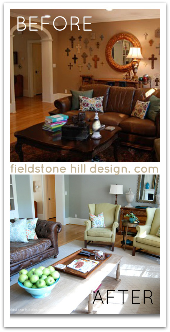
Here are pictures of Richella’s space before:
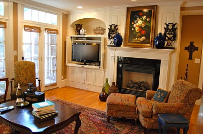
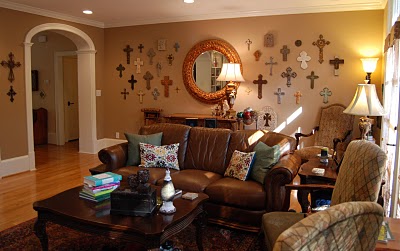
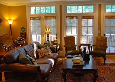
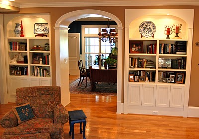
{images via Imparting Grace}
After working with Richella one on one regarding her needs, wants, and dreams for this space, I crafted this design board for her:
THE DESIGN:
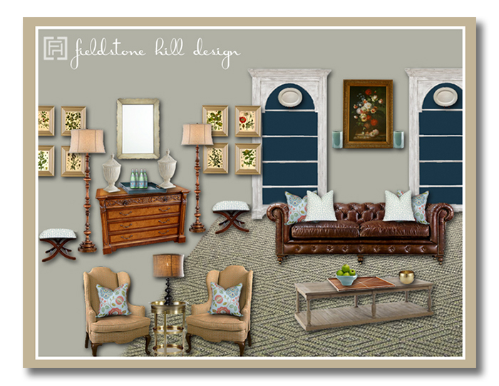
We used several items that Richella already had, and repurposed them. The wingback chairs got new fabric, the ottomans were a Target find that Richella recovered in an aquamarine geometric I found. The sideboard is a favorite piece of hers that we used again, but I modernized it with a lighter, fresher mirror. And the painting above the mantle is a favorite of Richella’s as well, so I used it for color inspiration and we kept it front and center.
The bookshelves got a coat of paint on the interior shelving to connect the space to her dining room, and we simplified the decor with a large platter at the top of each bookshelf to make for a bolder look against the blue. I also simplified the wall of crosses with symmetrical botanical artwork to allow that side of the room to breathe a bit more and make a statement – this helped bring attention to the sideboard that Richella loves.
One of the big changes in this room was layout. We used two large leather chesterfields and I created the floor plan so that the sofas could face each other, one of my favorite looks. This gave all the guys (a tall hubby and 3 tall sons) a comfy place to sit. I love that!
I am thrilled with the new feel this nearly-finished living room already has!
AFTER:
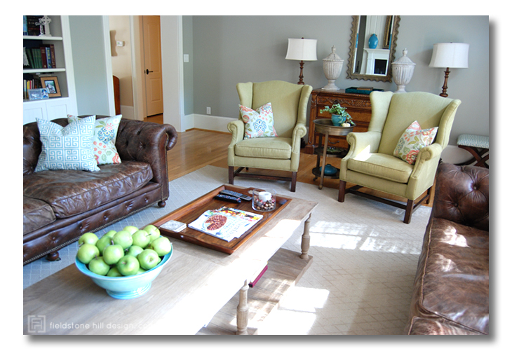
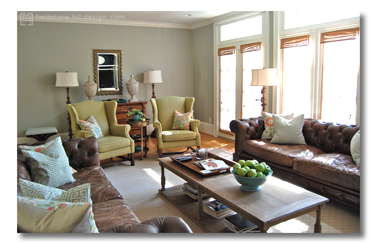
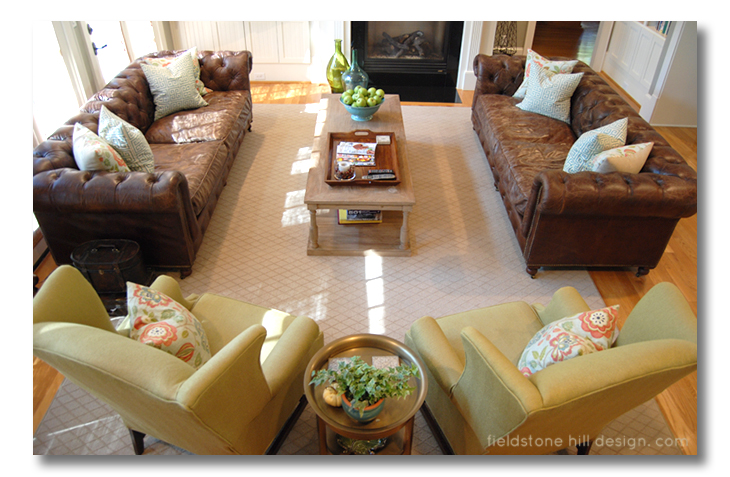
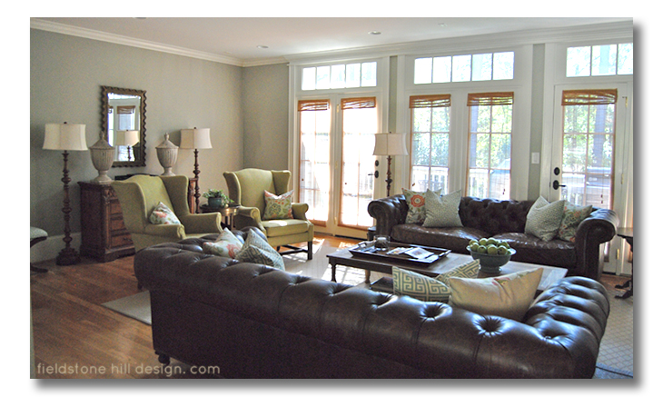
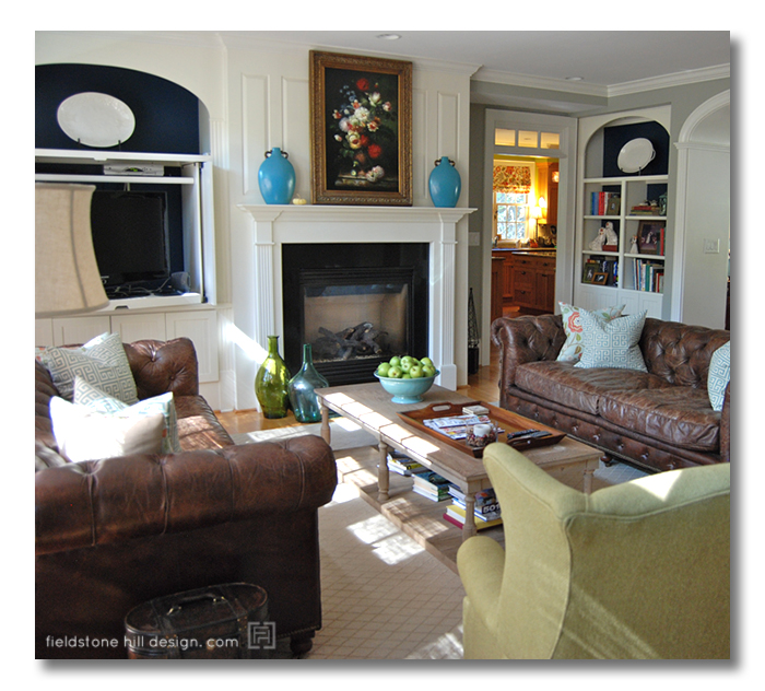
As you can see, we really brightened up her space and adding some luxurious seating. And although we added larger furnishings, we created more breathing room and visual symmetry to let the eye ‘rest.’ We are both so happy with the results!
The one finishing touch that will really MAKE this room is when Richella adds a set of eight pieces of art on the sideboard side of the room. I have given her the recommendation that whatever she finally chooses there, whether she goes with my selection or not, she should attempt to pull out colors from her gorgeous floral oil painting, and use them in this art as well to connect both sides of the space.
You know what I think about drapes and why they are SO wonderful for your decor! One recommendation that did not work for this client (because of her pup-dogs), that I would have loved to see in this room are light and breezy drapes from ceiling to floor. Possibly these gorgeous drapes in Ivory from Serena and Lily.
Thank you, Richella, for blogging about your experience in working with me and the eDesign process in general! And thank you for being a delight to work with. I hope this room will bless you and your family for many years!
And for those of you who are just itching to get in on some Fieldstone Hill eDesign, I am hoping to open one or two slots by the end of January. Fingers crossed and all that. Maybe your gorgeous room will be next! Stay tuned by signing up for blog updates below.
What about this transformation is your favorite? Let us know in the comments below!
******
SO. I may or may not have gone completely nutso buying stuff for my gorgeous Georgia Lu this weekend. I LOVE LOVE LOVE Tea Collection clothing. And they have babies – women. Snag some pretties now: this great sale lasts until Sunday:
* * * * *
Take daily, bite-size steps toward living in a home you LOVE: Be sure to subscribe to FHD via email, bloglovin, your fave reader, and follow Fieldstone Hill on Twitter, Instagram, and Facebook!
Don’t miss a single post from Fieldstone Hill Design! Have regular decorating goodness delivered {free!} directly to your inbox.
{This post contains affiliate links. Thanks for reading and supporting and clicking to shop via FHD! You are the best!}


you did such a great job making the english style look so pretty and serene and modern!
I love how you demonstrated what it means to allow breathing room for the eye. The room is beautiful!
So gorgeous! I love the traditional English style but it’s also modern and fresh. Those chesterfield sofas are to die for. I also love the furniture placement and new paint. Wonderful!
Beautiful work, Dar, designing a fresh and happy space. Yes, fewer, larger accessories give more, ahhhh, breathing space. I know they must love it!
Great job!! Love the color scheme. So fresh and airy. Beautiful!
What a stunning after. Awesome job. I love the hint of English library without being too literal. Love it!
Great job! So fresh and updated. I looked at the picture of the wall of windows and thought ‘Oh, I would love to see panels on those!’ and then read your comment about the dogs 🙂 Maybe she will get to add them in the future. Beautiful!
I used that same Greek key fabric on some pillows and on some stools I recovered this past summer! Such a fun pop in the room! Love your design!
Lovely! It’s fun to see your versatility as you tackle something closer to my style. 🙂 I can just picture it with the botanicals hung – gorgeous!
What beautiful light! I have four spoiled rotten pups and would still have to have some roman shades (black out- for movies) and some curtains, maybe even some sheers! Loving me some window treatments! I do adore those bookcases and the chesterfields too. I’m going to require several pillows and a cuppa tea when the movie starts….thanks eveh so much!
Gorgeous room and can’t wait to see how she finishes it off. Yall did a fab job!
Darlene,
Love this room! It’s hard to choose my favorite element because I love not only the lay out and how you lightened the room, but also how inviting it is – always key to a great LR. Also love the paint color, whatever it is!! Totally new room, great job!
Beautiful – but where are all the lovely crosses? I expected to see them displayed elsewhere.
fhd press:
FHD’s popular posts
sponsors I love
peruse
shop like it’s your job
FHD in blogland
categories
31 Days of Favorite Spaces A room I love about me Affordable Designer Rooms beautiful colors beautiful thoughts Bebe bebe bebe nursery before and after BHG blogland built-in of the Week client spaces contrast decorating yourself defining your style design boards design in progress design question ditto ditto d.i.y. ditto-worthy designers en masse farmhouse simplicity five faves for a song from my files here at Fieldstone Hill hiding the uglies high-gloss glamour Home tour Images Of inspiration Inspired to lessons in design living with beauty Living with Beauty: Beauty Tips and Tricks Living with Beauty: Wellness Living with Beauty: Whole Food Eating Living with Beauty: Within Master Designer mixed metals must have objects organizing overcome decorating paralysis project project kitchen project library project nursery punch color renovation rituals room by room sponsor style notebook traditions trends Uncategorized vision
Archives
Theme by Design by Kendall