Well hello lovely folks. Happy ditto Monday. Hmmm, I think I am in the mood to snoop around someone else’s space today. How about a ditto-worthy home tour of Elizabeth Bauer’s studio apartment?
{**Down-to-earth update from the Pregnant Wonder of Fieldstone Hill: Two weeks until my due date, people! Two weeks!! My goodness. This makes for lots of slow moving and plenty of napping. As I was chatting about in this post about shifting focus, it is really amazing how your focus changes when you are expecting a little one. My last 2 years, I got to experience a new ‘freedom’ as my boys grew more independent. But, with God’s help, I am turning my heart back toward home as we await the arrival of a sweet baby girl. I am finding it really hard to crank out posts {as in: I don’t want to. haha! If it wasn’t for all of these design thoughts spinning through my head!}… my heart’s desire is to nest up my home, finish up client projects, wash baby clothes, and love on my boys in extra doses. Oh, and sleep. I feel like I am right where I am supposed to be. And that feels lovely. Sometimes I get a twinge, like I am “missing something” with my awesome blogging buds {love you people!!}, whose friendships are a treasure and a blessing to me. But, this twinge is far more bearable than the twinge of “missing something” in my own precious home. So, in toward home I turn. & One more note from the Pregnant Wonder: As of today, I have temporarily closed all of my design services to new clients. I will be up and running with abbreviated services once our mobile finds its new balance. Until we meet again! I cannot wait to help you add beauty to your homes!}Now. Onto to some light-hearted design ogling. Perfect way to start the week!
This ditto-worthy tour features a VERY smartly designed NYC studio apartment by Elizabeth Bauer.
It was featured back in the day, in Lonny June/July 2010 {images by Patrick Cline}, and I have never featured it here at FHD. It is definitely worth of our attention, with TONS of ditto-worthy design tricks that could inspire you to make the most of ANY small space – from a small room to a studio apartment.
Ditto Worthy Tour
Elizabeth Bauer’s NYC studio apartment
ditto:
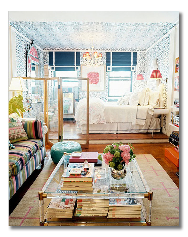
1// I wonder if she added that small step-up into the bedroom area. Perfect space-dividing trick!
2// A see-thru screen divides the space, not the light
3// a HUGE mirror adds the illusion of size and bounces extra light around the space
4// And don’t miss how she took the wallpaper around to the ceiling, creating her own border {rule breaker! LOVE it!}
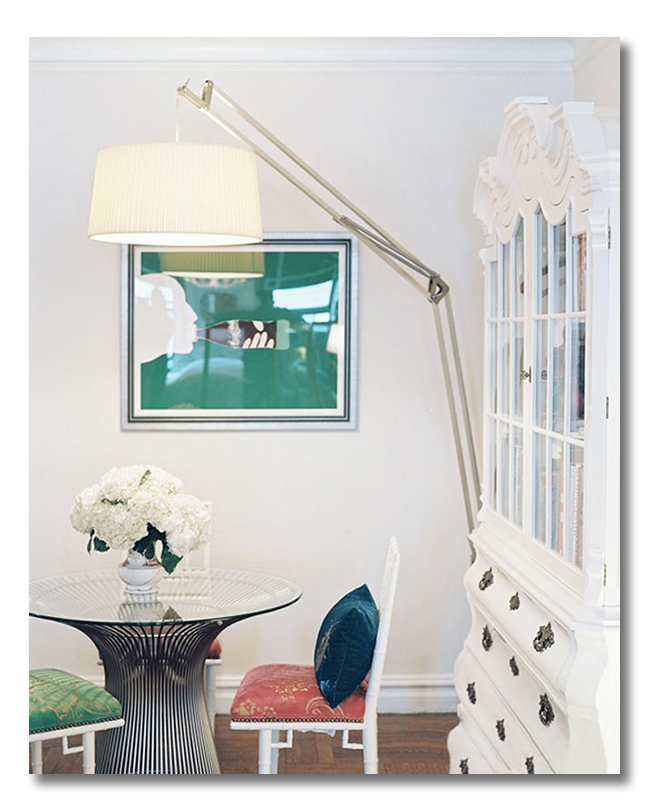
1// a small, round, glass table lets light pass through and has an airy quality that won’t weigh down a studio apartment
2// paint it white. Again, this keeps things from getting heavy in such a small space.
3// by using a very small round table, the air continues to move around the furnishings. While pushing a small square table up to the wall might seem to make more sense, the eye actually loves not getting trapped, and the space feels larger.
ditto:
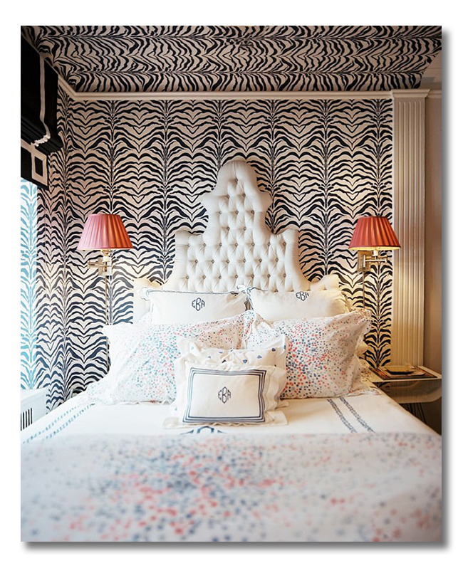
1// gutsy wallpaper defines the bedroom area, and makes the bedroom space a bit cozier than the rest of the space. Even a cozy/small space can benefit from more cozying, if done well.
2// coral lamps flank the bed. Not hard-wired, this is a great solution in a rental space. And the more light the better, no matter the size of your home!
ditto:
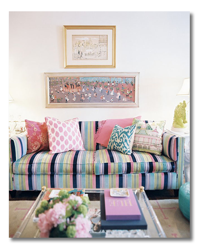
1// double stack your art using horizontal pieces, for a creative arrangement above a sofa, and to draw the eye upward. This creates the illusion of height.
2// don’t be afraid of an awesome, colorful vintage sofa. It could completely rock your space if you add great pillows and a throw that highlight the pattern’s best features. Loud pattern CAN work in a small space if balanced well.
3// I love that chartreuse horse lamps! An eye-catcher that can be enjoyed from both sides of the room-dividing screen.
ditto:
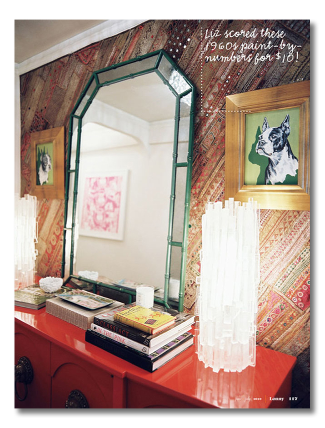
1// lacquer. color. and chinoiserie goodness. Oh, look: another mirror!
2// somehow, when you add wide gilded frames to anything, they can become AMAZING! Good art gives the eye a place to rest.
3// um. those lucite kryptonite lamps rock my world!
ditto:
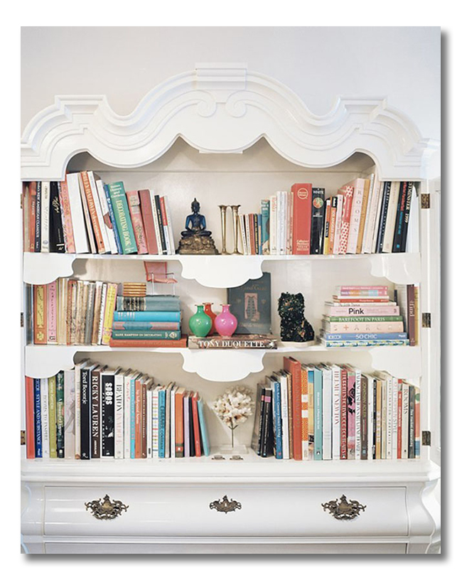
1// a well decorated bookshelf…. with books {head here for my bookshelf styling tips}!
ditto:
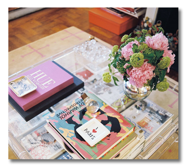
1// one must have gorgeous flowers. The end.
2// a well-decorated table display {great display ideas here}, on lucite, of course! The lucite is yet another example of furnishings that allow the eye to move around the space.
ditto:
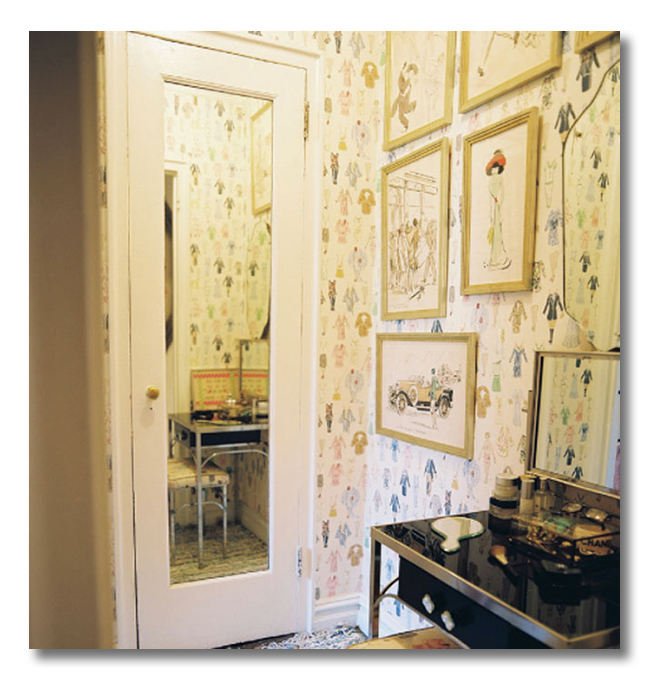
1// paper doll wallpaper is perfect for the fashionista lover. I love how busy pattern is used in this small corner.
2// a full length mirror and a lacquered vanity add reflection and shine to a teeny dressing space.
* * *
There is so much to learn from this well-designed, well-executed, beauty-filled space.
What would you ditto?
Have you considered borrowing ideas from brilliantly designed studio apartments?
Find more inspiration like this:
ditto-worthy gentleman’s spaces
How to decorate a narrow entryway
My Inspiration for beautiful decor displays
* * *
Take daily, bite-size steps toward living in a home you LOVE: Be sure to subscribe to FHD via email, bloglovin, your fave reader, and follow Fieldstone Hill on Twitter, Instagram, and Facebook!
* * * * *
Fieldstone Hill Design is offering a new design service! Transform your home in just 2 hours!
Find out more about this consultation here: The Skype “In-Home” Consultation
* * *
{the following is an affiliate link. When you click through my site, you help support this website’s cost and time. Thank you DEARLY!}
* * * * *
Don’t miss a single post from Fieldstone Hill Design! Have regular decorating goodness delivered {free!} directly to your inbox.



I’m really digging this col
Oops….user error on the previous comment. What I was trying to say is…I’m really digging this color palette and all the pattern play!!! The sofas is such a bold choice and completely out of my comfort zone but I love it!!!!
I’m so excited for you…almost there!! Spend every moment with your little boys and nesting. Don’t worry about blogging, we will miss you but this is WAY more important!
Blessings,
Kayla
Kayla, you are an angel! Thanks for your sweet words!
Hi Darlene,
Love the space!! the colors are awesome.
I do have a question about sconces because I’d been thinking to get a couple for our bed. Do you think that they could look like cheap hotel room? I want to buy some from pottery barn and not hard-wired so we don’t have to have a professional doing holes in our wall. But I’m afraid that it can look cheap, I do not want tall lamps because our bedside tables are very simple (ikea patio tables 😉 but I like them) and we are not buying other furniture for now, but I can buy the sconces because I save some money.
Thank you and I hope you show us more of your baby nursery, if not I can wait until later, your family is first 🙂
no, I don’t think it looks cheap. Unless you buy really cheap lights! I like when the cords have cord covers in brass, or cord covers that are painted to match the walls.
Thanks for your comment!
I think I could live in this space! And loved the bookshelves post, too. = )
Thanks for answering Darlene, your opinion is very important to me. I am sorry I sounded spoil or like if I was complaining. I guess I’d been watching a lot of movies and I see sconces at hotels and I was afraid my room will look like that, but you are right I’ll choose a good product.
Thanks for your advise
not spoiled at all! It is really important to be sensitive to details in design!!
fhd press:
FHD’s popular posts
sponsors I love
peruse
shop like it’s your job
FHD in blogland
categories
31 Days of Favorite Spaces A room I love about me Affordable Designer Rooms beautiful colors beautiful thoughts Bebe bebe bebe nursery before and after BHG blogland built-in of the Week client spaces contrast decorating yourself defining your style design boards design in progress design question ditto ditto d.i.y. ditto-worthy designers en masse farmhouse simplicity five faves for a song from my files here at Fieldstone Hill hiding the uglies high-gloss glamour Home tour Images Of inspiration Inspired to lessons in design living with beauty Living with Beauty: Beauty Tips and Tricks Living with Beauty: Wellness Living with Beauty: Whole Food Eating Living with Beauty: Within Master Designer mixed metals must have objects organizing overcome decorating paralysis project project kitchen project library project nursery punch color renovation rituals room by room sponsor style notebook traditions trends Uncategorized vision
Archives
Theme by Design by Kendall