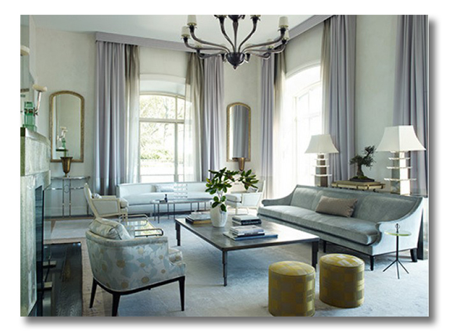
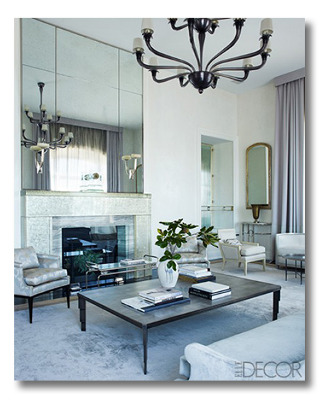
Today’s ditto takes my breath away. It is a room of icy cool interiors, and the mood is calm, cool and relaxing – yet TOTAL elegance. The color palette steals the show, and the symmetry and form pleases the eye. Let’s take a look at this space and ditto its amazing-ness.
*{What exactly is a ditto? :: The list below will break down for you many of the decorating concepts that are employed in this great space. As with all of our dittos, let’s study the DETAILS of what makes this space SO AMAZING, so that we can learn how to add more beauty to our own homes!!! And, as always, I look forward to hearing from you and finding out what you would ditto, too. So, be thinking!}
{Design by William Sofield, featured in Elle Decor}
DITTO :: {WHAT I WOULD STEAL FROM THIS SPACE}:
1. ICY TONES.
Silvers. Pale pale blue. Pale pale lavender. Grays. Whites. Warmed up only by a few green plants and some splashes of gold. Ditto! {Want to see more silver and gold combos? Check it here. And as you can see, I am kind of obsessed.}
2. DON’T FORGET THE SHIMMER.
It is not just the color choices that make these icy cool interiors! It is the subtle addition of shimmer throughout the space. The rug is not just silver in color, but {likely by the addition of silk} it is also silver-y. The drapes are not just a pale pale lavender; they are also a waterfall of flowing sheen. The grand mirror reflects light and sparkle. And the huge polished marble fireplace bounces the light. All of these shimmery textures add to the overall icy cool feel. Ditto!!
3. A CONSOLE TABLE WITH LAMPS BEHIND THE SOFA.
This is one of my favorite design features to add to a living room. It adds instant layering and symmetry. Such an elegant look. You can see it in my designs via this design board, this design board, and this design board, and others. Ditto!
4. LEGGY FURNISHINGS.
I prefer leggy furnishings in a space {as opposed to chairs and sofas where the upholstery “body” goes all the way to the ground}. The reason why I love leggy pieces is because the eye and the light and the air can freely move around and under the piece. That allows a space to feel bigger, but it also creates a breathable, light, airy feel. Ditto.
5. A HUGE COFFEE TABLE.
What an unbelievably huge coffee table! It pulls this grand space together. Plus, it can serve as an extra bed in times of need {kidding.}. Man is it huge. Love it! Ditto!
6. TWO MATCHING STOOLS FOR EXTRA SEATING.
Duo stools are Ditto-worthy in SO many spaces! Place two in front of a fireplace. Add two to a group seating arrangement. Place two at the end of a bed. Use two for a comfy alternative to a coffee table. Place one each under matching windows. Ditto!
7. SEPARATE CONVERSATIONAL SEATING AREAS.
This is not a new decorating trick. On the contrary. Conversational “zones” are old hat. But, really. They are wonderful! Why else sit in a lovely, icy cool, well-decorated room… but to enjoy the company of others and converse? In this space, the far sofa and chairs is more enticing to me. I think the huge {but SO cool!} coffee table might make it a bit too far to chat with everyone who might sit around the table. Still the side chairs could have a chat while the sofa and the benches have another chat. Isn’t it fun to imagine chatting in such a lovely space? Ditto!
* * * * * * *
SO much goodness.
Love anything I did not mention? or…
* * * * *
Check out our family Christmas cards here, and place your Minted.com order in time for Christmas! See site for great discount codes.

* * * * *
Are you a One Kings Lane Member? Pretty amazing stuff. I tell ya. And new things arrive on the scene every day, for up to 70% off.

* * * * *
Don’t miss a single post from Fieldstone Hill Design! Have regular decorating goodness delivered {free!} directly to your inbox.
{This post contains affiliate links. Thanks for reading and supporting FHD!}


What struck me first about this room is the tall ceilings and the furniture seems low, emphasizing the height even more. I also love the mirror over the mantle that duplicates the fabulous light fixture. The colors are cool and icy, and very restful. The two tones in the drapes are subtle, but keep it interesting.
I like the mirrors flanking the window with the tables underneath- lots of light and reflection.
I love the colors and textures in this room, and will be hanging my drapes from just below the crown mouldings. I may even do the cornice boards. I also love ‘leggy’ furniture because I have a very small cottage and the lack of skirting allows the eye to see more floor making the space look larger.
Love your blog,by the way!Thanks for all your hardwork!
fhd press:
FHD’s popular posts
sponsors I love
peruse
shop like it’s your job
FHD in blogland
categories
31 Days of Favorite Spaces A room I love about me Affordable Designer Rooms beautiful colors beautiful thoughts Bebe bebe bebe nursery before and after BHG blogland built-in of the Week client spaces contrast decorating yourself defining your style design boards design in progress design question ditto ditto d.i.y. ditto-worthy designers en masse farmhouse simplicity five faves for a song from my files here at Fieldstone Hill hiding the uglies high-gloss glamour Home tour Images Of inspiration Inspired to lessons in design living with beauty Living with Beauty: Beauty Tips and Tricks Living with Beauty: Wellness Living with Beauty: Whole Food Eating Living with Beauty: Within Master Designer mixed metals must have objects organizing overcome decorating paralysis project project kitchen project library project nursery punch color renovation rituals room by room sponsor style notebook traditions trends Uncategorized vision
Archives
Theme by Design by Kendall