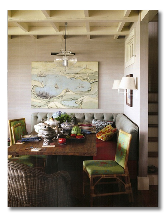
Today’s ditto | a room I love post features a creative and stunning dining banquette. This room is a great example of the power of contrasts.
{Ditto | Room I Love posts demonstrate a great exercise for you as you continue to develop your own personal style: using your own favorite pictures, and making a quick list of what you actually love about the space. If you study what you love about a space, it helps you to bring what you LOVE into your own home!}
Enjoy this stunning dining banquette, and the quick “ditto” list of why I love it.
So. Do you love it?:
{design by Jeffrey Bilhuber}
WHAT I LOVE {What I would ditto!}:
1. The tufted, gray and red banquette seating, of course! and the contrast that is created by the…..
2. awesome rattan dining chairs, which have energetic green cushions.
3. The hearty, rectangular wood table that grounds this fantastic eating nook. {contrasts with all of the soft fabrics and rounded curves of the banquette seating}
4. The soft gray grasscloth.
5. The transom window that pulls light into the hallway. Well, gee…. We did that too!
6. A large piece of art, in subtle grays and blues, adds further texture to the walls. {and contrasts with the bright red and green in the seating}
7. That awesome, detailed ceiling.
8. The lighting source comes from above and from sconces on the wall.
9. The grand size of this dining banquette. Most dining banquettes can only fit a small family… this one could handle Thanksgiving Dinner.
DO YOU LOVE IT?? WHAT DO YOU LOVE? WHAT DESIGN ELEMENTS WOULD YOU DITTO IN YOUR OWN HOME? DO TELL!!!!!!
* * * * *
Check out our family Christmas cards here, and Don’t forget to use your discount code FHD15 to place your Minted.com order before 11/18/12!

* * * * *
Are you a One Kings Lane Member? Pretty. Amazing. Stuff. I tell ya.

* * * * *
Don’t miss a single post from Fieldstone Hill Design! Have regular decorating goodness delivered {free!} directly to your inbox.
{This post contains affiliate links. Thanks for reading and supporting FHD! }


Love it Darlene, I am in the process of redoing my own kitchen/breakfast room and I want to do a banquette. I am a little worried that the tufted back will be stiff, so trying to figure all that out. I like the look of it but I want to make sure it is super cozy and comfy…I picture us sitting there in the morning, cozy having coffee…
That sounds amazing Lisa!! I am sure you are going to create nothing but a BEAUTIFUL kitchen space!
I love this! I love all the colors, plus we have been talking about updating our dining area, and we both like the table/bench/chair look. Banquette seating offers so much more than just a bench. The l-shape of the banquette is what I would ditto. 🙂
great point! I love that it can even offer storage if you are creative!
I always look for what I would ditto before scrolling to see what you’ve named – it’s fun to see if we’re on the same page at all 🙂 I thought of your #s 1-3 & 6-7 (especially the tufting and the contrasts!), but hadn’t even noticed the lighting or the transom window or the amount of seating available, which are all also great points! I’d only not do the grasscloth (it keeps surprising me that it’s so in right now!), but there’s a story behind that. Our first house was a total fixer-upper (1890s Victorian) and it had what was probably 70s or 80s grasscloth in the very teeny entryway. So my first ever experience with any home reno of any kind was removing that ugly wallpaper. There’s probably nothing that could ever make me like grasscloth 🙂
We had a U banquette growing up in our eat in kitchen. Even as a child I hated that thing. It’s no fun scooting around corners especially if the fabric is something that “grabs” like velvet. Much to the dismay of my mother I would crawl under the table to get in and out. It has tainted my ability to look at banquettes fondly ever since. I do love the colorful seating and the beautiful grass cloth walls.
fhd press:
FHD’s popular posts
sponsors I love
peruse
shop like it’s your job
FHD in blogland
categories
31 Days of Favorite Spaces A room I love about me Affordable Designer Rooms beautiful colors beautiful thoughts Bebe bebe bebe nursery before and after BHG blogland built-in of the Week client spaces contrast decorating yourself defining your style design boards design in progress design question ditto ditto d.i.y. ditto-worthy designers en masse farmhouse simplicity five faves for a song from my files here at Fieldstone Hill hiding the uglies high-gloss glamour Home tour Images Of inspiration Inspired to lessons in design living with beauty Living with Beauty: Beauty Tips and Tricks Living with Beauty: Wellness Living with Beauty: Whole Food Eating Living with Beauty: Within Master Designer mixed metals must have objects organizing overcome decorating paralysis project project kitchen project library project nursery punch color renovation rituals room by room sponsor style notebook traditions trends Uncategorized vision
Archives
Theme by Design by Kendall