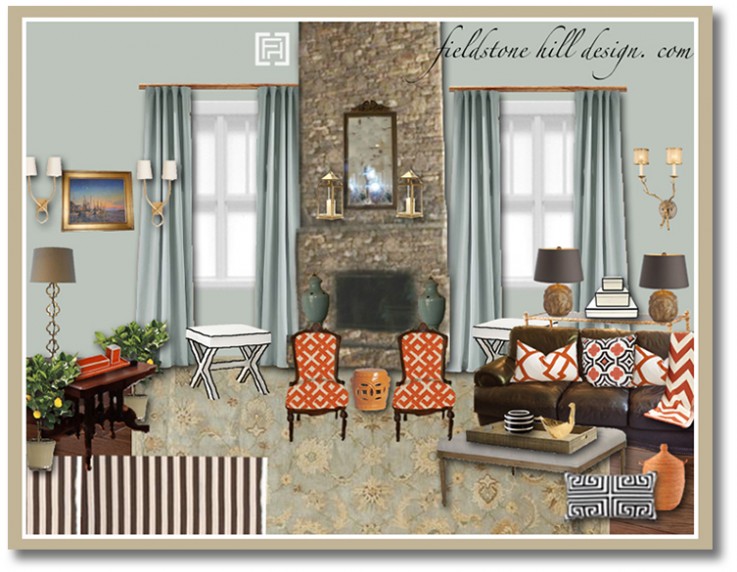
My client just moved into a new home, and just as you enter her house, you come right into a soaring great room. The ceiling is 2.5 stories high in some places, and there is a stone fireplace that rises between a wall of windows. My goal was to create a sophisticated great room that felt welcoming, and worked for a young family.
Spaces that are large and grand, like great rooms, often need to be “brought down to size” by creating a break in the height, and by using different “room zones” throughout the room. Room zones are different conversation groupings, as well as different furniture groupings that coexist within the same overall space.
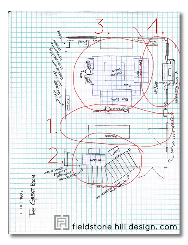
In this welcoming family room, the “Room zones” that can be found are:
1. Entryway
2. Music room
3. Conversation/Main seating area
4. Desk area
Not all of these zones are distinguishable on the Design Board, so I thought I would also show you the floor plan for this space:
My client had a lot of furniture that she wanted to integrate into the space. The design board consists of both her current furnishings, brand new furnishings, family heirlooms, and re-upolstered pieces.
What I love about this space:
1. The contrasting mix of traditional and graphic prints.
2. The cool aquas versus the warm melon tones.
3. The sophisticated white X-benches with chocolate piping {that match the nesting boxes on the console!}.
4. The client’s antique table that is being used as a desk.
5. The elegant tone-on-tone look of the walls and the curtains.
6. Warm and modern pillows dress up a comfy leather sofa.
7. Splashes of gold accents are strewn throughout.
8. The lemon trees!
9. The stunning accent fabrics. Even pricey fabrics can make an appearance when used in moderation.
What do you think of this eDesign? Have you ever thought about adding “room zones” to your space? I love hearing your thoughts!
* * * * *
* * * * *

Don’t miss a single post from Fieldstone Hill Design! You can have every post delivered directly to your inbox. It is free, and your email is never used for another purpose.
be sure to check your email, confirm your subscription, and get your freebie link!
If the subscribe box does not work click here to go to the Fieldstone Hill Design page and submit in the right sidebar.
{this post contains affiliate links}


What a fabulous design, Darelene. I love the colour scheme–and the mix of textures feels just right. I only wish my rooms were big enough to divide into “zones”!
The big room thing is a blessing and a curse, but zones do help to make big rooms feel wonderful and purposeful. My favorite rooms always happen to be small rooms that are designed well and have brilliant storage!
and THANK YOU!! for your sweet words about the design!
oh dear, I aplogise for misspelling your name.
Loving the orange and brown, especially now that Fall is approaching.
Thank you SO much!!
Love the mix of warm and cool, vibrant, friendly, classy. I like great rooms in concept and you did a great job here creating a functional space. Scale of furniture has to fit the space. Is bigger better? Accessories – should they be big
ger as well in large spaces? I have smaller spaces but I still like larger scale items.
Thank you, Cheryl!! As always, I love your insight!
As far as your accessories question, I think it is important to have some large scale art, drapes, and longer furnishing {not necessarily BIG furniture}, but I personally prefer treating the “room zones” on a “normal size” scale, drawing the eye comfortably into each zone.
Beautiful space and ideas, and I love the different zones you have created. Just wondering if there are any ideas for filling some of the vertical space that comes with such high ceilings….it can feel rather cavernous and create a noisy room. Thanks for your always inspiring blog.
I think that highly hung curtains are a must {hung as high as possible, they also provide a horizontal line with the curtain rod. I also think thick curtain rods are important in grand rooms}. I also think large art is essential as well! Great question!!
Just beautiful, Darlene. I love it!
Thank you, Suzy!!
Loving all of the orange! I hope we get to see pictures when it is actually done!
Black-edged X bench with black-edged boxes–just the right amount of graphic. And, are those lemon trees? I love that bit of fantasy, too.
For the first time, we do have a room zoned into two spaces. Our living room is like a bowling alley. We have the two chairs and ottoman in front of the FP and then the whole sofa arrangement. I likes it.
You make this look so easy and natural – looking at the sketch makes me think “of course!”. That is skill at work!
fhd press:
FHD’s popular posts
sponsors I love
peruse
shop like it’s your job
FHD in blogland
categories
31 Days of Favorite Spaces A room I love about me Affordable Designer Rooms beautiful colors beautiful thoughts Bebe bebe bebe nursery before and after BHG blogland built-in of the Week client spaces contrast decorating yourself defining your style design boards design in progress design question ditto ditto d.i.y. ditto-worthy designers en masse farmhouse simplicity five faves for a song from my files here at Fieldstone Hill hiding the uglies high-gloss glamour Home tour Images Of inspiration Inspired to lessons in design living with beauty Living with Beauty: Beauty Tips and Tricks Living with Beauty: Wellness Living with Beauty: Whole Food Eating Living with Beauty: Within Master Designer mixed metals must have objects organizing overcome decorating paralysis project project kitchen project library project nursery punch color renovation rituals room by room sponsor style notebook traditions trends Uncategorized vision
Archives
Theme by Design by Kendall