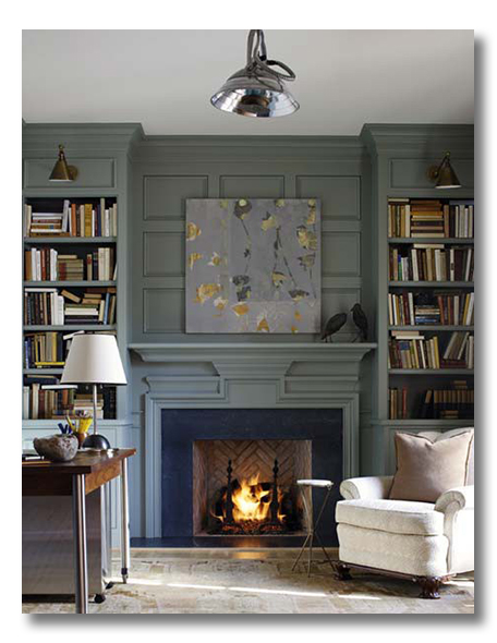
FHD’s “ A Room I Love” series….just a simple hello, from me to you, featuring a Room that I Love, and a quick list of why I love it. Do you love it?:
{via}
WHAT I LOVE:
1. anyone turn their heat off yet, but the nights are just a tidbit cold? Nothing, nothing beats a real fire.
2. the detailed paneling above the fireplace.
3. bookshelves. flanking a fireplace.
4. an industrial pendant in a mostly traditional library.
5. modern art takes center stage. And contrasts beautifully with the rest of the conservative feel in the space.
6. library sconces above the bookshelves. A must-have finishing touch for a gorgeous library.
7. a worn antique rug. my favorite for next to a fireplace. Must be the horse-country girl in me.
8. shelves crammed with books. Isn’t that what a library is for?
9. richly painted woodwork in a pasty peacock.
DO YOU LOVE IT?? WHAT DO YOU LOVE? DO TELL!!!!!!
* * * * * * *
this post is sponsored by TaraLynEvans.com


Oh my gosh. I’m with ya. I love it and call me crazy, I love the black birds on the mantel. (I think that’s what they are….) I love the soft antiqued blue with the pops of yellows. So pretty.
First of all, I love the chair (looks so comfy) and the drinks table beside it. Then, the oushak rug, bricks laid on the diagonal in the firebox, the color of the walls, the lights mounted over each side of the bookcase, and the artwork. Last, I like that they were not afraid to stuff the shelves with books, instead of very few books and more decorative accessories! (And, this from a girl who loves collections and decorative accessories.)
wall of books+fireplace+cozy chair next to fire= dreamy!
Oh yes, I love it. Such a warm and inviting color, the architecture is stunning, and of course, the books lure you straight in…
I love the books. Bookshelves that have six books, mostly space and several decorative accessories look GREAT but then where do I put my books? Just from 13 years of home school, we have literally hundreds of books. Hard to make just books look good, but they managed!
Love the contrast of modern lighting with the more traditional space AND the books are not neatly stacked nor are the bookshelves too self-consciously styled, giving the feel of a lovely used space.
fhd press:
FHD’s popular posts
sponsors I love
peruse
shop like it’s your job
FHD in blogland
categories
31 Days of Favorite Spaces A room I love about me Affordable Designer Rooms beautiful colors beautiful thoughts Bebe bebe bebe nursery before and after BHG blogland built-in of the Week client spaces contrast decorating yourself defining your style design boards design in progress design question ditto ditto d.i.y. ditto-worthy designers en masse farmhouse simplicity five faves for a song from my files here at Fieldstone Hill hiding the uglies high-gloss glamour Home tour Images Of inspiration Inspired to lessons in design living with beauty Living with Beauty: Beauty Tips and Tricks Living with Beauty: Wellness Living with Beauty: Whole Food Eating Living with Beauty: Within Master Designer mixed metals must have objects organizing overcome decorating paralysis project project kitchen project library project nursery punch color renovation rituals room by room sponsor style notebook traditions trends Uncategorized vision
Archives
Theme by Design by Kendall