Today’s ditto post is part two of two posts I have done on this {awesome} room. I had two pictures of this space, from two different angles, and it was far too gorgeous to lump both pictures together. Far too ditto-worthy! You can read Part One of this ditto room {you really must see it!} by clicking here.
Enjoy dissecting this room {featured in Chicago Home and Garden}, and discovering what you would like to ditto from this space. I can’t wait to hear your thoughts!
DITTO :: {WHAT I WOULD STEAL FROM THIS SPACE}:
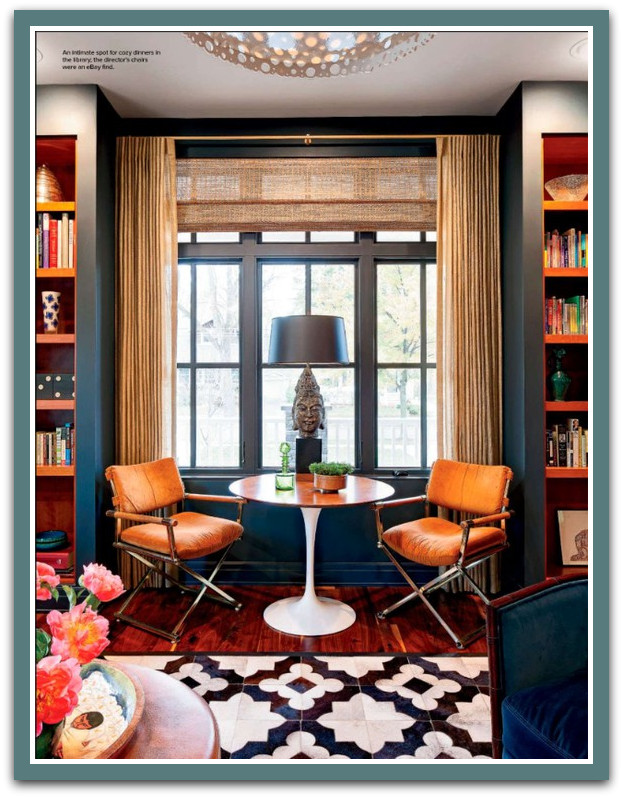
- those chairs, oh, those chairs. Directors chairs with chrome and wood would be enough to make my heart go pitter patter… but then upholster them in a comfy, cozy orange suede?? These chairs are deeee-vine, and very, very ditto-worthy.
- the must-have sitting nook. I really adore the concept of a sitting nook that fits snugly into a recessed window area, and includes two chairs, good lighting, and a table. Everything you need for a good book and good company. If I could, I would add a sitting nook to every single room; they invite you to stay a while.
- orange as a punch color. Those orange bookshelves! Those orange chairs! I’ve told you how much I love each one of these design elements, but it is worthy to note how fantastic they are together! Orange becomes a classy and vibrant punch color for this library, and it adds such gorgeousness to this room. It is not hard to convince me to use orange as a punch color; it has just the right amount of warmth, guts, life, and joie de vivre!
- shed a little light on your bookshelves. I love the addition of good lighting right in front of bookshelves. Here, the bookshelves have recessed lighting mounted above them, and angled in to offer the perfect light. But my favorite lighting above book cases are mounted portrait lights, en masse, above each bookshelf column. They are a simple, but powerfully classy touch. Not to mention, practical.
- a modern, round table with an airy feel. I am not sure if you have noticed how much I love furnishings that have legs that allow for air to pass beneath them. I believe that it lends a delicate openness to your space; the flow of air from piece to piece keeps a room from feeling heavy or stifling. The round, white, vintage table that sits in this reading corner is a classic piece that also has a lot of “air-flow” beneath it. So, even though the shape of the table is modern and strong-in-presence, the overall feel is still light and free. Love.
- painting the windows to match the walls. This is a trick that gives a room such polish. The gray-blue color of the walls are so dramatic, but the drama is kicked up a notch when even the window frames and muntins are painted the same color. A gutsy move that can be easily ditto-ed.
- fresh plants, of course. There are so many pops of color, art, drama, boldness and crispness in this room. Even so, the soft elements of nature are still right at home, bringing balance to this space. A room, no matter how gorgeous, could always use a touch of the living. Ditto-ing the use of wonderful plants and bouquets is always called-for.
- the rug, the colors, the walls, the restraint, the bold pieces. There is so much more to say about this space. And wouldn’t you know it: I went on and on about this room last week.. so to read more, click here.
Weigh in. So, what would you {steal} from this space??
WHAT WOULD YOU DITTO, 1-8? OR SOMETHING ELSE?
I LOVE HEARING YOUR THOUGHTS!


