Wednesday, October 12, 2011 by {darlene}
It’s “A Room I Love” Day….just a simple hello, from me to you, featuring a Room that I Love, and a quick list of why I love it:
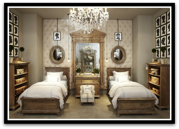
This stunning room, and its unique design elements, immediately caught my eye. I can imagine it as a girls’ room, or as a fantastically dreamy guest room. Do you love it??
{ via Restoration Hardware}
WHAT I LOVE:
- the symmetry!!! of course.
- that teeny-tiny precious chair in the center, that invites a small child, or maybe a doll.
- twin, matching beds flanking a small dresser. I have always loved this room layout.
- all of the french ticking!
- tufted walls. amazing.
- silhouettes. en masse, even! Oh, how I love thee.
- the cream, natural, and pale wood color scheme.
- a crystal chandelier. always wonderful.
- vintage suitcases for storage.
- grand mirror and petite mirrors.
DO YOU LOVE IT?? WHAT DO YOU LOVE?


This is such a pretty space! I love the chandelier and oversized mirror. Love all the things you have been doing on your blog too! Hope you are well.
Oh, thank you Stacy! You are so sweet!!
Oh!!! The chandy, the colors, the wood, the silhouettes, it’s gorgeous. You have completely turned me towards loving some glam…a girl needs that in a house full of boys. 🙂
you are sounding like me: torn between farmhouse simplicity and glam!! It is a fun place to dream!
While not a fan of restoration hardware’s new look, this room is perfect. And that teeny chair…to die for!
I do like this design. It has some great ideas in it. I think I would throw a pop of color with pillows. Maybe orange…Than it would be perfect!
Just stumbled across your blog today and I am so glad I did!!! Your home is just beautiful! Lots of great inspiration!!
I am so glad you did too! Feel free to follow along {I love followers. it’s a sickness} and come back anytime! Nice to meet you!
What a great space! Looks like it belongs in a castle!I like the dropped little lights next to each bed 🙂
I Love it all except for that silly little chair in the center which is so out of scale!!
Stop by to enter my giveaway!
Love this space! Especially how the designer kept each side so uniform. Thanks for sharing.
fhd press:
FHD’s popular posts
sponsors I love
peruse
shop like it’s your job
FHD in blogland
categories
31 Days of Favorite Spaces A room I love about me Affordable Designer Rooms beautiful colors beautiful thoughts Bebe bebe bebe nursery before and after BHG blogland built-in of the Week client spaces contrast decorating yourself defining your style design boards design in progress design question ditto ditto d.i.y. ditto-worthy designers en masse farmhouse simplicity five faves for a song from my files here at Fieldstone Hill hiding the uglies high-gloss glamour Home tour Images Of inspiration Inspired to lessons in design living with beauty Living with Beauty: Beauty Tips and Tricks Living with Beauty: Wellness Living with Beauty: Whole Food Eating Living with Beauty: Within Master Designer mixed metals must have objects organizing overcome decorating paralysis project project kitchen project library project nursery punch color renovation rituals room by room sponsor style notebook traditions trends Uncategorized vision
Archives
Theme by Design by Kendall