Today I am finishing up a small series on using Impact Color in your space, or what I call “punch colors.“
When I began writing about this concept, a blog friend of mine came to mind immediately.
Why?
Because she knows how to seriously rock color, and she knows how to use punch colors in her spaces to make them phenomenal.
Meet the very talented Shannon Berry.
I just love how this girl uses color! Don’t you?? And not just any color… Gutsy color!
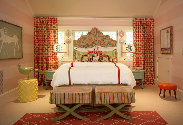
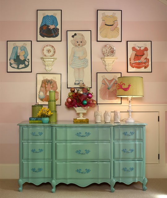
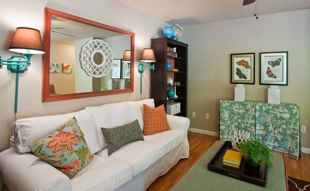
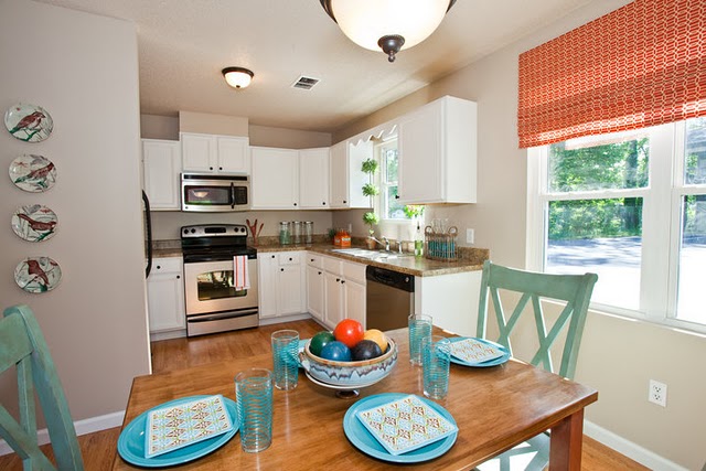
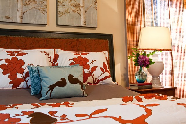
And feast your eyes on the four pictures below. They feature a project where Shannon renovated and staged a townhouse space.
So, with a very modest budget, she whipped up these wonderful spaces.
You must go to her post and read more.
Great use of color in all of these spaces. And with the exception of the orange club chairs {which she got for a steal anyway}, all of her fantastic color additions are great examples of successfully, and creatively, using a punch color.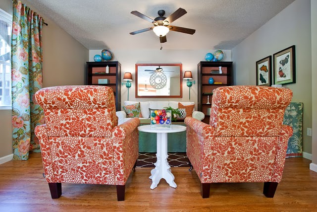
For more ‘punch color’ posts, click here.
And thank you to everyone who is cheering me on in my dream of Fieldstone Hill Design.Love Fieldstone Hill? thanks. you rock. Would you consider sharing the love by Following {click Follow in the right sidebar}, Liking on Facebook, or linking here from your blog. I just knew you were awesome!


I have been thinking about lining some bookshelves with patterned paper, and these photos were just the kick in the pants I needed. Now I need to find just the right color and pattern!
Thank-you so much Darlene! I love being included in your punch color series!
How gorgeous is this room! I feel so much better about my orange faux paus that just happened with our new furniture. This is just incredible and cheerful. Love it and the punch colors. Great post.
Darlene it's nice to meet you! Your blog is lovely and very inspiring. I really appreciate your kind visit today. I'm happy to have found yours. I'll be back again soon. Please come by and see me again anytime. It's wonderful to meet new blog friends. You're always welcome.
Warmly, ~Melissa 🙂
wow — those rooms are amazing! thanks for the introduction…heading over to her blog now!
She is amazing, right??? The girl's room was just pure happy.
Oh my, that room with the sweet pillows just makes me cry! And, the paper doll wall. I was a Betsy McCall paper doll girl when I was very young. My precious Granny Moseley saved every McCalls magazine for when I came to visit. Every month they had a new Betsy with outfits. I treasured them and the memories they left. Thank You, for sharing! ~ Jo
I like that the same color scheme is used throughout bringing a sense of unity.
LOVELY!
fhd press:
FHD’s popular posts
sponsors I love
peruse
shop like it’s your job
FHD in blogland
categories
31 Days of Favorite Spaces A room I love about me Affordable Designer Rooms beautiful colors beautiful thoughts Bebe bebe bebe nursery before and after BHG blogland built-in of the Week client spaces contrast decorating yourself defining your style design boards design in progress design question ditto ditto d.i.y. ditto-worthy designers en masse farmhouse simplicity five faves for a song from my files here at Fieldstone Hill hiding the uglies high-gloss glamour Home tour Images Of inspiration Inspired to lessons in design living with beauty Living with Beauty: Beauty Tips and Tricks Living with Beauty: Wellness Living with Beauty: Whole Food Eating Living with Beauty: Within Master Designer mixed metals must have objects organizing overcome decorating paralysis project project kitchen project library project nursery punch color renovation rituals room by room sponsor style notebook traditions trends Uncategorized vision
Archives
Theme by Design by Kendall