4 simple steps for
creating an affordable designer room
{you can have it all!}
Thank you so much to all of you for your kind and wonderful comments on my boys’ room reveal post! I was especially glad that my slow decorating process was an encouragement to many of you – and, that encouraged me to hear you say you were in the same boat as well!
Although I often wish I had more cash flow/time to work with as I decorate {who doesn’t?}, there is something thrilling about creating a classy, designer room for a reasonable cost. But in order to do that, there are a few tricks I had to have up my sleeve. I am excited to share those with you today! For this post, I will be using my boys’ bedroom as the main example, but these tips can be applied to any and every room in your home.
Super Important Disclaimer: there is NO formula to good interior design! But, I wanted to create an outline for the absolute beginner who feels paralyzed, giving them some basic steps so that they can proceed with confidence. Designer rules are made for breaking! They always have been. So, as you begin, let this be a loose guideline.
1. Pick 2 main, base colors
Where to begin when starting in on your room design? Your first step is making your core color selections: select two colors that can function as amazing and flexible background colors. These colors will be predominant in your space and will be used for your wide, sweeping uses that take up a lot of visual space, such as wall color, flooring, bedspread backgrounds or large upholstered furniture. Think of these colors as your large “canvas” on which you will paint.
My personal opinion for your base colors is that – aside from black and white – they should be muted, slightly “muddy” colors, so that they work with both cool and warm tones. This keeps the space flexible if you ever want to change your “punch” colors {more on that in a minute}.
Here are some examples of how this would work – for visual learners:
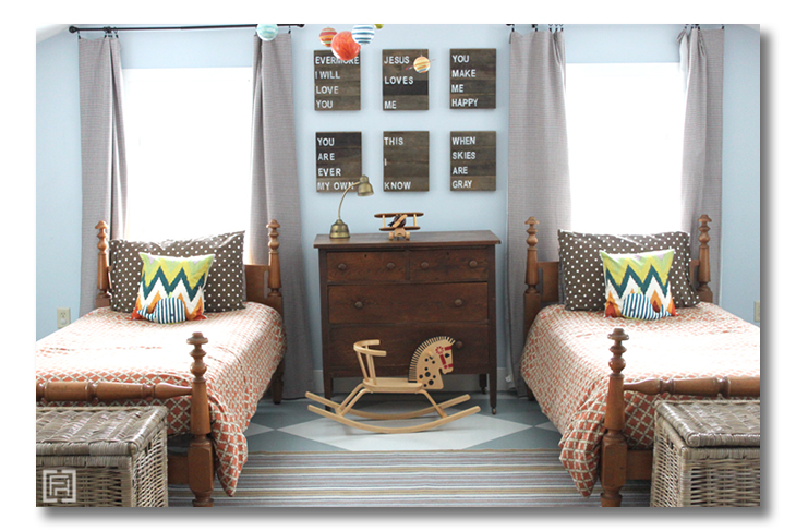
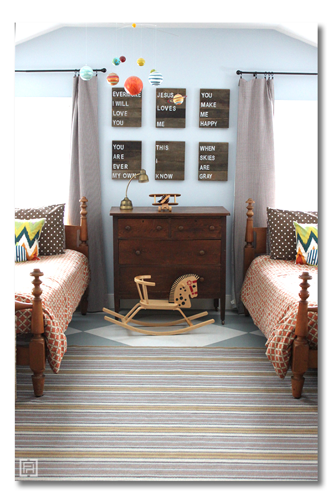
In my boys’ bedroom, I picked muted, soft blue and brown-orange as my base colors. These are softer, muddy colors that would go with anything and have a neutral feeling.
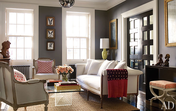
In this amazing room belonging to Brooke Shields, that I ditto-ed here, the base colors are charcoal and ivory:
How This Tip Saves You Money:
Picking your colors is the first, foundational step when aiming for an affordable, designer room. This is very important because it will give your room focus, AND, it will save you money because you will have a guideline. Super important when you want to save money: have a focus and stick with it! The muted tones are flexible, so they will work throughout the years, without having to repaint, change flooring, or change your large pieces.
2. Pick 1-3 bold accent “punch” color{s}
Next, I select 1-3 colors for my bold color {or, the punch color, as I call it}.
For the boys room, I selected bright orange and strong navy. These colors have a strong presence, and pop out against any background color – they pack a punch. Hence, “punch” color!
And sometimes they evolve. I often start with one clear “punch” color, but add more if I see something fun popping out of a fabric or accessory I am using in the room.
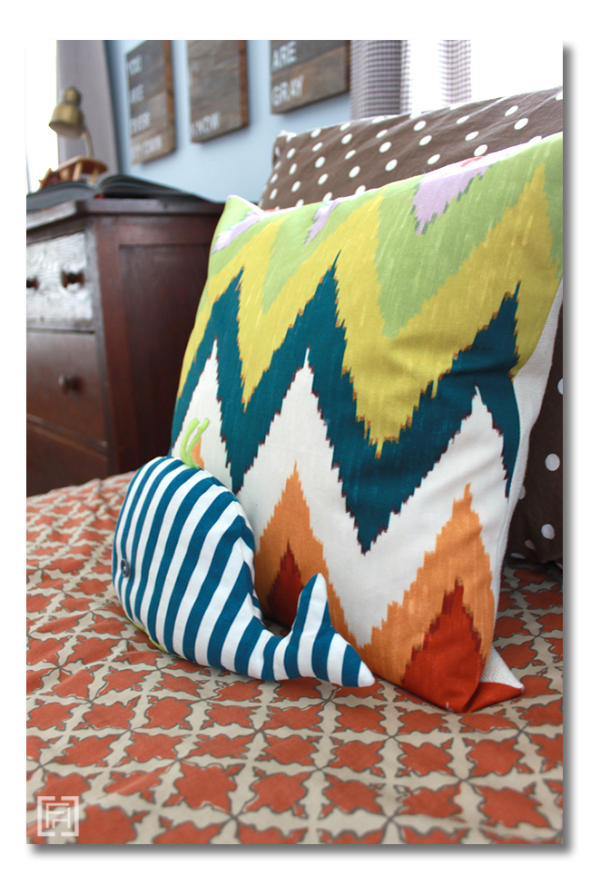
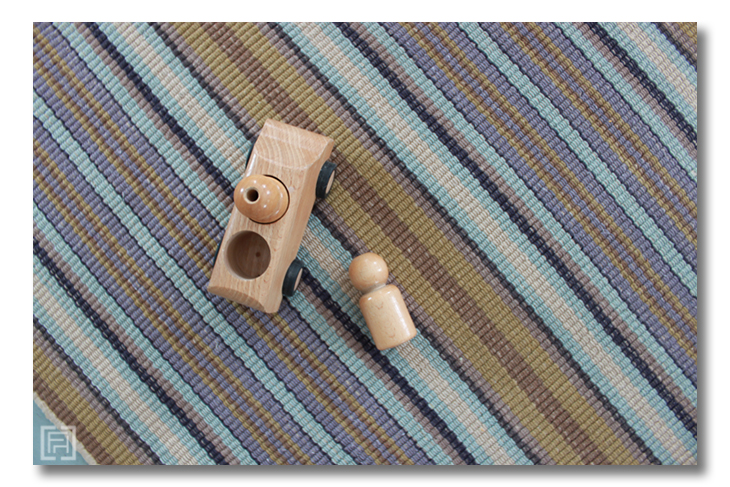
For example, in the boys’ room, I fell in love with Schumacher’s Adras Ikat in Caravan because it pulled out the perfect orange and navy, in a fun and classy pattern. But, then wait! There is a tiny bit of lavender in this pillow… and then, lo and behold, there is also a tiny bit of lavender in my Treehouse rug! A new accent color emerges. Lavender! I wouldn’t say this one packs a “punch,” but it is yet another color I can layer here and there as I find accessories for the space.
How This Tip Saves You Money:
Again, selecting concrete colors gives your room focus, AND, it will save you money because you will have a guideline. It is particularly fun to have this focus when it comes to accessory and fabric shopping with your “punch” color.
3. Select Foundational pieces
For an affordable designer room, I recommend first tackling your foundational pieces, selecting items that stick within your 2 main, base colors or are black, white or wood.
When I started with the boys room, this meant, make flooring and wall decisions, and choose the large furniture. I painted the walls in a soft, muted blue, and painted the floors in an even further muted blue-gray and off-white. Then, I selected the beds and the dresser to be very classic and flexible. I do not plan on ever changing these pieces while my boys are under my roof, so I went for, again, Classic and Flexible.
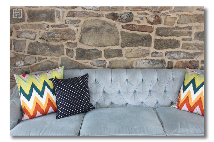
The sofa was found later, because I could not afford to buy the sofa I wanted. My plan was to wait until I found the right piece, in the right color, for the right price. Because I had a PLAN and KNEW my BASE COLORS, I could wait with confidence. The perfect piece turned up in a youth group room at a local church! The sofa was in perfect condition, just the right color, and in a timeless Hollywood regency design. I wouldn’t need to change a thing. So, I pulled on my big girl boots, and chatted with the Pastor to see if I could bless the church in exchange for the sofa. They were so happy to help, and got a great leather sofa from me in exchange – perfect for youth group Super Bowl parties. They kept asking me, are you SURE you want this Grandma sofa? Ummm…… YES!
Key Tip:
Buy used furniture, not new or antique. This is definitely an opinion of MINE, but I believe it hook, line, and sinker. New furniture, unless you can afford very pricey pieces, just does not have the quality of the past. True antique furniture is overpriced. Instead, seek out sources for Used furniture, such as Garage sales, Craigslist, Used Furniture shops, and Consignment shops.
How This Tip Saves You Money:
Used furniture is not only quality, with gorgeous lines, but it is also the most affordable option. By selecting your large pieces in base colors, you will have pieces that will last you throughout the years. Your space can still evolve, and you can easily change your “punch” colors to change the entire feel of the room — without ever having to buy another large piece of furniture!
4. Add patterns, freely
This is really one of the greatest secrets to designer rooms. Without it, you can have a lovely space… but I don’t believe it will cross the line into “designer” style.
Add patterns, and add more than one! Boldly and freely.
There are two ways I recommend adding pattern to achieve a designer look for a great price:
1. Choose several one-color-tone pieces for several of your large scale objects {potential choices: your rug, your main bedding, an upholstered side chair, your curtains}, but choose them in a pattern. The examples of this in my boys room are the curtains and sheets {all in muted brown tones, but with pattern}, and the bedspread {all in the muted orange tones, but with pattern}.
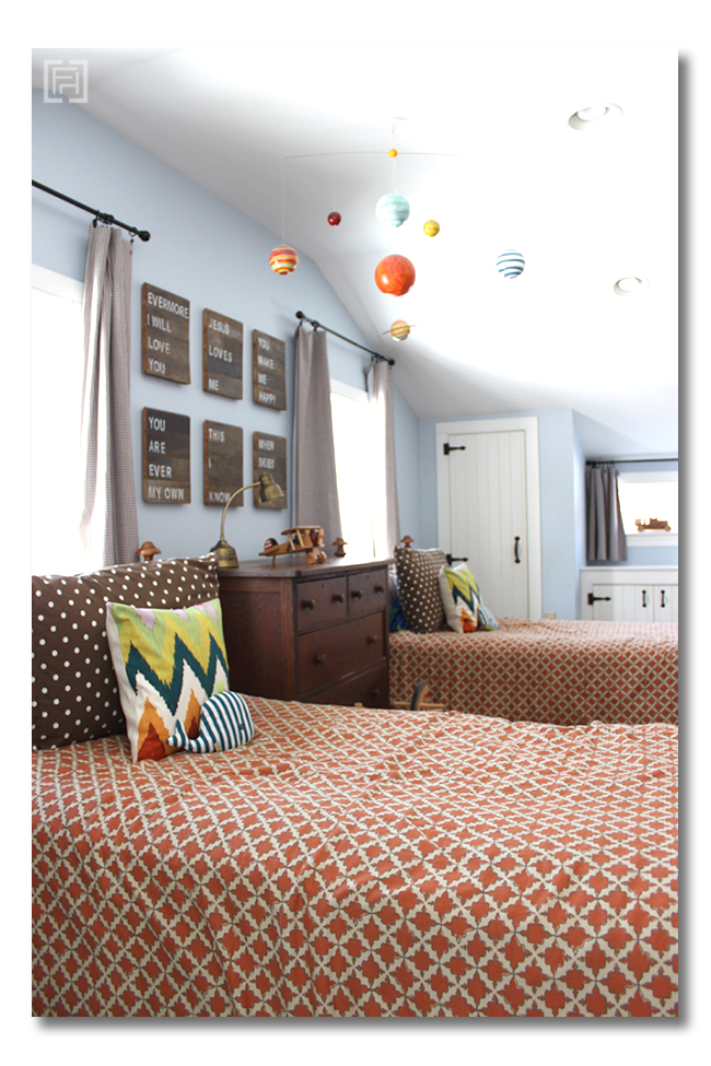
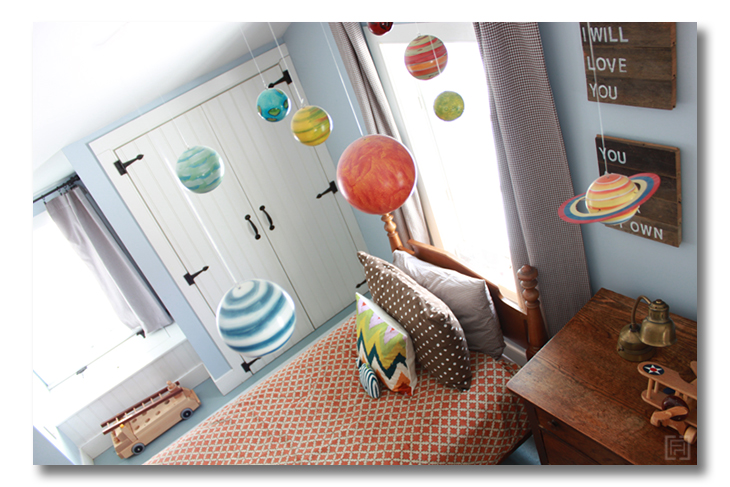
2. This step is KEY to getting that designer look. Choose several, “wow” accessory pieces – that are actually designer quality – that use one or more of your punch colors, but also with a pattern. This is where you should splurge! The examples of this in my boys room are the Schumacher pillows, the solar system mobile, and the whale pillows.
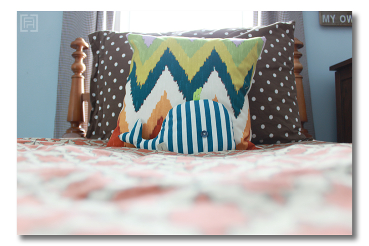
Notice that I freely combined different types of patterns in this space! There are morrocan tiles, stripes, dots, ikat, etc. But they are unified with color.
Key Tip:
This is where you should be spend-y. Especially with Pillows or your fabric accents. Save money in the entire room, but buy expensive accent pillows or drapes in gorgeous designer fabrics. I had to swallow a large gulp when I pulled the trigger on my Schumacher pillows, but I know I will never regret them.
How This Tip Saves You Money:
If I had settled for something less than this designer accent, I would have missed out on the very thing that MAKES the room. This may have cost me more money in the end due to dissatisfaction with my space. Doing something right and beautifully the first time will always save you money.
* * *
I know this post is choc full, but it is worth the study!
With these tips, you will be on your way to a gorgeous, designer room, without having to break the bank. And the affordable designer room that you create will not be filled with compromises and second-hand choices! Have it all!!
Which affordable designer room are you going to tackle?
Stay connected! There will be more posts to come in this Affordable Designer Room Series!
* * * * *
For the sources in my boys’ room, please head to this post.
Take daily, bite-size steps toward living in a home you LOVE: Be sure to subscribe to FHD via email, bloglovin, your fave reader, and follow Fieldstone Hill on Twitter, Instagram, and Facebook!
* * * * *
I use Essential Oils to help my family stay healthy, my home stay clean, and my rooms to smell wonderful. Click here to learn how you can get top quality Essential Oils.
Also, read up on some ways to use Essential Oils in your everyday living.
* * * * *
Don’t miss a single post from Fieldstone Hill Design! Have regular decorating goodness delivered {free!} directly to your inbox.
{This post contains affiliate links. You are supporting this blog and the info I share with your clicking love! Thank you SO very much for reading and supporting FHD! }


Great tips, my favorite is to add patterns!
This post IS choc full of steps & inspiration. I printed it out. I’m verryyy slowlyyy starting to plan my master bedroom re-do. Money is always the issue. This is helping me focus. Thank you!
I guess my living room is what I am tackling first. Money isn’t an issue, but my husband doesn’t believe in decorating, so I can’t spend much on it. He prefers our walls completely bare of any decoration. I didn’t know this before I started the process of decorating, but it has come out. He looks at rooms I pin and design boards here at fieldstone hill, and houzz and says, about everything he sees, “um, no thanks. Too busy. No knick knacks, no vases, no pictures on the walls, no mirrors, no rugs…can’t we just keep things simple and plain?” Our living room is completely bareft of art, the only furniture is a couch, a chair, and a buffet to hold dishes.
I’m finding if I go very slowly, and add just a thing or two at a time that he is comfortable with more. But it has to be slow, so I just decorated the mantle. And I change it out seasonally, for over a year now, and he doesn’t mind. I have put some art on the mantle, and now that he’s used to it, I am going to try moving it to a wall, and replacing it so something else on the mantle that I can move to the wall.
Why am I telling you all this? Because my POINT is that going slowly and having a plan frustrated me before, but now I’m thankful because I’m seeing how he really would have been uncomfortable if I had just done a lot right from the start. And I would have made a lot of mistakes along the way so neither of us would have been happy!
You have this great way of taking interior design and breaking it down into steps and making it a logical process. And without taking the creativity out of it. I’m printing this out to keep handy. Sometimes I need things like this to help me focus.
Such a great post my friend! Simple and easy steps to achieve great results!
Excellent post that makes so much sense of things that now seem crucial but that I wasn’t previously able to articulate (or apply in my own decorating endeavors).
I need to apply the base color principle in my master bedroom. It needs a second base color, as right now everything is in the reds family (peach, yellow, red) and it lacks contrast.
Would the color of wood furniture be considered one of the base colors? In your boys’ room, for instance, do the beds and dresser intentionally tie into the brown/orange concept? And if you have wood furniture of a certain color (mine is dark mahogany) should you think about picking up that color in some of the textiles and other objects in the room?
Thank you for the tips! This post was just what I needed. I’m trying to pull together a room and just not sure what it needs. I think I need another punch color and several more patterns. Thanks!
fhd press:
FHD’s popular posts
sponsors I love
peruse
shop like it’s your job
FHD in blogland
categories
31 Days of Favorite Spaces A room I love about me Affordable Designer Rooms beautiful colors beautiful thoughts Bebe bebe bebe nursery before and after BHG blogland built-in of the Week client spaces contrast decorating yourself defining your style design boards design in progress design question ditto ditto d.i.y. ditto-worthy designers en masse farmhouse simplicity five faves for a song from my files here at Fieldstone Hill hiding the uglies high-gloss glamour Home tour Images Of inspiration Inspired to lessons in design living with beauty Living with Beauty: Beauty Tips and Tricks Living with Beauty: Wellness Living with Beauty: Whole Food Eating Living with Beauty: Within Master Designer mixed metals must have objects organizing overcome decorating paralysis project project kitchen project library project nursery punch color renovation rituals room by room sponsor style notebook traditions trends Uncategorized vision
Archives
Theme by Design by Kendall